Design comparison
Solution retrospective
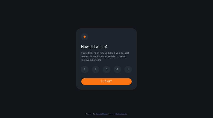
Hello, I am a newbie. This project is all vanilla. Comments very appreciated.
I tried using radio buttons but as of now did not see any advantage of it. Are there any?
I have not figured out a better way to make sure only one button can be selected at a time and also not proceed to thank you card if no button is selected.
Thank you.
Community feedback
- @jgreen721Posted over 2 years ago
nice job! the UI experience looks like we're updating our state(highlighted button changes) of rating with each click but I did see you went with an array in your JS and just tested to see if it was empty. It works! But since in this case 'we'(the application) ever needs to know the most updated rating selection, you could have just gone with a regular variable and tested to see if it was undefined in your submit button logic. I see your updating your HTML there anyways every-time a user click, may as well update single variable rather then collect unnecessary (stale) values in the array. Again, your logic works, I only suggest since you asked. But ya, good job on it!
Marked as helpful0@PavlinaPsPosted over 2 years ago@jgreen721 Hello, I appreciate your comment, I am going to try it. Thank you!
1 - @Sudarsh1010Posted over 2 years ago
-
change the font-weight of SUBMIT button and 'How did we do' title to 700 font-weight: 700;
-
On the screen above 1440px your component is not centered.
-
Remove Border from SUBMIT button.
-
There should be different on-hover styling and on-Click styling for the 1-5 rating button and remove the border.
That's all and keep up the great work bud!
Marked as helpful0@Sudarsh1010Posted over 2 years ago@Sudarsh1010 to question you asked:
-
You can choose whatever method you as far it works. I used 5 buttons. you can it out in my Github repo.
-
I used 5 buttons and I haven't worked much with the radio button so I don't know about it. If I find any solution I will reply to this comment with the solution.
-
Use alert if no buttons are selected.
Marked as helpful0@PavlinaPsPosted over 2 years ago@Sudarsh1010 Hello, thank you very much for your comments. I have already fixed the font-weight and centered the component. Regarding the border, I think there is a tiny border on the design.jpg. I down-sized it to only 1px. Since I don't have the Figma file, it is hard to say for sure. Thanks again - this is my first project here.
1 -
Please log in to post a comment
Log in with GitHubJoin our Discord community
Join thousands of Frontend Mentor community members taking the challenges, sharing resources, helping each other, and chatting about all things front-end!
Join our Discord