Submitted about 1 year ago
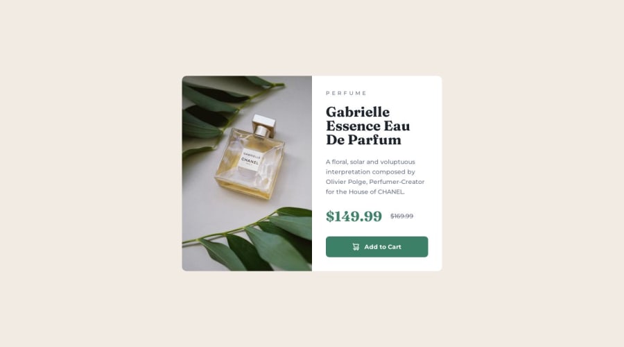
Vanilla CSS, Flex, Grid, Mobile-first, BEM - Product preview card
@anar-sol
Design comparison
SolutionDesign
Solution retrospective
I'm interested in learning more about code organization but, as this is a fairly small project, I haven't found it necessary to use custom CSS properties or any other method of code reuse.
Any advice is welcome =)
Community feedback
- @pRicard0Posted about 1 year ago
Some HTML tips
- Instead of using the tag
<span>
with the text "$149.99", you can use the<em>
tag. The<em>
tag is used to define emphasized text. The content inside is typically displayed in italic. A screen reader will pronounce the words in<em>
with an emphasis, using verbal stress. - You can use the tag
<s>
instead of the tag<span>
with the text "$169.99". The<s>
tag specifies text that is no longer correct, accurate or relevant. The text will be displayed with a line through it by default.
CSS tip
- You can add this to your button:
transition: 150ms
Marked as helpful0@anar-solPosted about 1 year ago@pRicard0 Thanks for your comment, especially about the html. I hadn't thought of these elements to add semantics to the price part of the card.
0 - Instead of using the tag
- @caioiknPosted about 1 year ago
Seu design ficar super idêntico!
Você assina o PRO para pegar o arquivo do Figma, ou tem algum outro segredo?
0@anar-solPosted about 1 year ago@caioikn Yes, I had a pro subscription so I still have the figma files for some challenges.
1
Please log in to post a comment
Log in with GitHubJoin our Discord community
Join thousands of Frontend Mentor community members taking the challenges, sharing resources, helping each other, and chatting about all things front-end!
Join our Discord