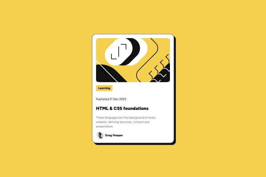
Design comparison
Solution retrospective
I think this time I was closer in terms of small details like the 1.5 line lengths and box shadows etc.
What challenges did you encounter, and how did you overcome them?Issues Padding a Div
I had my Learning tag like this:
Learning
and my css was adding paddinglike
.topic-tag {
   padding:1px
}
For some reason this added a margin of way more than 1px.
I fixed this issue by getting rid of the div
Learning
I still don't get why this happened.
Issues With Responsive Layout
I still don't understand how to make responsive UIs. The pixels specified in the markdown don't seem to actually match what looks good on my laptop. And right now I just set max-width and min-width.
Community feedback
- @gilotinPosted 27 days ago
Hello, your card is looking great , I'll give you just little suggestions for better HTML semantics and try to explain me why you need documentation.
- You can use <section> or <article> for one of the div tags, because you are creating card that should have <h1> instead of topic tag. This is important for good accessibility and SEO.
- Please provide structured documentation (readme.md file) it's important for future projects when you are applying for jobs. The documentation example is provided in the materials. If you don't know Markdown you can check in YouTube for more info.
Marked as helpful1
Please log in to post a comment
Log in with GitHubJoin our Discord community
Join thousands of Frontend Mentor community members taking the challenges, sharing resources, helping each other, and chatting about all things front-end!
Join our Discord
