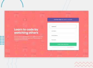
Design comparison
Solution retrospective
At the moment, I have done three projects. This time, I share the last of them. I incorporated JavaScript in the validation of a form. Hope you like. I know that I still have many things to improve. Any help or advice is welcome :)
Community feedback
- @JasonP670Posted about 3 years ago
This looks really good. In fact when I first opened it I thought it was an ad so I closed it. I think that says how good it looks. I just wanted to point out that I'm looking at this on my phone. And on my phone the text in the green button gets cut off because it tries to expand beyond the end of the button. Good job! Looks really good!
Marked as helpful1 - @kens-visualsPosted about 3 years ago
Hey @GabrielAlberini 👋🏻 it's me again 😂
I know you're currently working on JS, but let's not forget about responsiveness of the project, I've got some feedback that might be helpful. I'm assuming that you're not building the website with mobile first principle, please correct me if I'm wrong. So I'm going to suggest everything with
@media (max-width: SOME_NUMBER) {}. If you're not familiar withmedia queries, here is a link from CSS-Tricks that mentions everything about it.- So to make it responsive on both mobile and tablet viewport widths, let start from
@media (max-width: 758px) {}
@media (max-width: 758px) {
    flex-direction: column;
    text-align: center;
}
add this to lines to
.containerand like a magic, your website is responsive now. All you have to do is to play withfont-sizes, so they're not huge on the mobile screen.I hope this was helpful 👨🏻💻 don't be shy Gabriel, have to admit that you made it really close to the design as well 👌🏻 Cheers 👾
Marked as helpful0@GabrielAlberiniPosted about 3 years ago@kens-visuals Thanks you so much for yours advices! You have rason, I don't begin with mobile first. I wouldn't even know how to do it :/. But don't worry, I'm learning. I will surprise you 8)
Very good the tip that you told me about the medias querys in tablet. I already implemented it and it was excellent. Thanks once again! :)
0@kens-visualsPosted about 3 years ago@GabrielAlberini you're welcome 😇 Yeah, go for it, surprise me 👀
Marked as helpful1 - So to make it responsive on both mobile and tablet viewport widths, let start from
- @GabrielAlberiniPosted about 3 years ago
Oh! Tanks you so much for your feedback Jason! :) I will try fix what you tell me.
Although it is rare, that error does not appear to me. I'll take a good look. 8)
0
Please log in to post a comment
Log in with GitHubJoin our Discord community
Join thousands of Frontend Mentor community members taking the challenges, sharing resources, helping each other, and chatting about all things front-end!
Join our Discord
