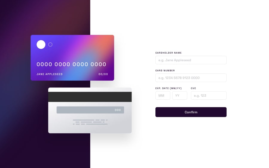
Design comparison
SolutionDesign
Solution retrospective
The difficult thing for me was the fact of the animations, I had mistakes in that part that took me time to solve, in addition to the responsive theme that I feel that I did not do it well due to the structure of my html but it is something that remains an experience for me
The area of my code that I am not sure about is the responsive part since I do not have the necessary knowledge to make a better design thinking about the user experience
I would like to know the opinion of the community of: What are the best ways to make a page responsive?
Community feedback
Please log in to post a comment
Log in with GitHubJoin our Discord community
Join thousands of Frontend Mentor community members taking the challenges, sharing resources, helping each other, and chatting about all things front-end!
Join our Discord
