Not Found
Not Found
Not Found
Not Found
Not Found
Not Found
Not Found
Not Found
Not Found
Not Found
Not Found
Not Found
Not Found
Not Found
Not Found
Not Found
Not Found
Not Found
Not Found
Not Found
Desktop design screenshot for the QR code component coding challenge

This is a solution for...

  • HTML
  • CSS
1newbie
View challenge

Design comparison


SolutionDesign

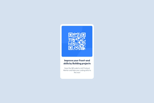
Solution retrospective


What are you most proud of, and what would you do differently next time?

I am proud that I was able to create a responsive and visually appealing layout for the QR Code component, using semantic HTML and CSS effectively. I also appreciated the opportunity to apply flexbox techniques to center the elements.

What challenges did you encounter, and how did you overcome them?

I tried to make it as similar as possible.

What specific areas of your project would you like help with?

I would like help with the footer, as I was unable to add it without it interfering with the width of the QR Code. The layout is out of alignment, and I need guidance on how to include the footer without compromising the presentation of the component.

Community feedback

Adriano 36,770

@AdrianoEscarabote

Posted

Olá Emilly, Tudo bem??

Bem-vinda a comunidade do Front-end Mentor!!

Gostei muito do resultado do seu componente, mas tenho algumas dicas que pode ser útil:

Você usou <br>. Usar <br> não é apenas uma má prática, é problemático para pessoas que navegam com o auxílio de tecnologia de leitura de tela. Leitores de tela podem anunciar a presença do elemento. Isso pode ser uma experiência confusa e frustrante para a pessoa que está utilizando o leitor de tela.

Você pode ler mais no MDN

Como este projeto é baseado em um único componente de página, não há necessidade de uma tag h1. No entanto, é sempre uma boa ideia evitar erros de acessibilidade, por isso acredito que seria benéfico para você adicionar um h1 neste componente. Não se preocupe se você esquecer do h1, mas é uma boa prática quando você estiver desenvolvendo sites maiores.

Quando estou fazendo algum desafio que é só um componente eu gosto de fazer isso:

<h1 class="sr-only">Qr code component</h1>

.sr-only {
   position: absolute;
   width: 1px;
   height: 1px;
   padding: 0;
   margin: -1px;
   overflow: hidden;
   clip: rect(0, 0, 0, 0);
   white-space: nowrap;
   border-width: 0;
}

fazendo isso você terá um titulo visivel apenas para leitores de tela!

O resto está ótimo !!

espero ter ajudado.

Marked as helpful

0

@emillymoitinho

Posted

Olá Adriano, tudo bem e com você?

Muito obrigada pelo feedback e pelas dicas!!

@AdrianoEscarabote

1
P
Steven Stroud 11,810

@Stroudy

Posted

Exceptional work! You’re showing great skill here. I’ve got a couple of minor suggestions that could make this stand out even more…

  • Using a <main> tag inside the <body> of your HTML is a best practice because it clearly identifies the main content of your page. This helps with accessibility and improves how search engines understand your content.

  • Avoid using id selectors for styling in CSS because they are too specific and hard to override, making your styles less flexible and maintainable. Instead, use class selectors (.), which are reusable and more manageable, allowing for better control over your styles and easier updates.

  • Every page should have atleast one <h1> per page,

  • For future project, You could download and host your own fonts using @font-face improves website performance by reducing external requests, provides more control over font usage, ensures consistency across browsers, enhances offline availability, and avoids potential issues if third-party font services become unavailable. Place to get .woff2 fonts

  • Using a full modern CSS reset is beneficial because it removes default browser styling, creating a consistent starting point for your design across all browsers. It helps avoid unexpected layout issues and makes your styles more predictable, ensuring a uniform appearance on different devices and platforms, check out this site for a Full modern reset

  • While px is useful for precise, fixed sizing, such as border-width, border-radius, inline-padding, and <img> sizes, it has limitations. Pixels don't scale well with user settings or adapt to different devices, which can negatively impact accessibility and responsiveness. For example, using px for font sizes can make text harder to read on some screens, Check this article why font-size must NEVER be in pixels. In contrast, relative units like rem and adjust based on the user’s preferences and device settings, making your design more flexible and accessible. Use px where exact sizing is needed, but prefer relative units for scalable layouts. If you want a deeper explanation watch this video by Kevin Powell CSS em and rem explained. Another great resource I found useful is this px to rem converter based on the default font-size of 16 pixel.

I hope you’re finding this guidance useful! Keep refining your skills and tackling new challenges with confidence. You’re making great progress—stay motivated and keep coding with enthusiasm! 💻

0

Please log in to post a comment

Log in with GitHub
Discord logo

Join our Discord community

Join thousands of Frontend Mentor community members taking the challenges, sharing resources, helping each other, and chatting about all things front-end!

Join our Discord