

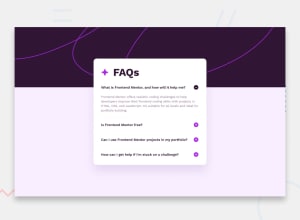
Design comparison

Solution retrospective
I think it turned out well. I do like the design. I don't think I would do much differently save the feedback I get from here.
What challenges did you encounter, and how did you overcome them?Understanding how to make an accessible accordion based on the aria authoring practices guide and translating it to this specific accordion based on the example given there. Also understanding how to create css selectors based on different named panel-controls buttons and selecting a sibling element related to the aria-expanded attribute having a true value and displaying the sibling panel.
I found out how to at least do the bare-minimum from the authoring guide and eventually added keyboard navigation using the up and down arrow keys while attempting to make the html as semantic as possible and allowing native button controls using tabbing.
eventually i found out how to select a class using the [class*=] selector
[class*='panel-control-'][aria-expanded='false'] {
  /* do something */
}
and to select a parent that has a sibling based on the design from the authoring practice guide
h2:has([class*='panel-control-'][aria-expanded='true']) + .hidden {
  display: block;
}
in the case of [class*='panel-control-'], it will match any panel-control-* wildcard ie: panel-control-1, panel-control-2, etc. Adding the [aria-expanded='true'] will select the panel control that is currently expanded and selecting the .hidden class on the image to swap out the + and - image icons associated with the button based on the expanded state.
I would like help with two areas...
-
I added functionality for the up and down arrow keys to be able to navigate the accordion giving focus to the next button that needs it (or the previous depending on the button). It almost acts as a focus trap when reaching the very first or very last button element in the article. However, tabbing away will focus outside of the accordion as it should. Would this be considered expected behavior or does something need to change?
-
The associated panels are just paragraph elements. According to the authoring guide, it doesn't appear that there is any hidden attribute on them to indicate to screen readers that this is a hidden panel element. Does this need to be added? I didn't add a display or visibility property to the selectors. I only changed the height to
0to give thehiddeneffect. Is this ok?
Are there other things I can do to improve my accessibility?
Community feedback
- @Mahnoor366880Posted 14 days ago
Hi there,
Great Work! on your neat project—it’s clear you’ve put a lot of thought into both its functionality and usability!
-
Arrow Key Navigation: Your implementation of using the up and down arrow keys to move focus among the accordion buttons is spot on. It’s completely acceptable if the focus stops at the first or last button, and allowing the Tab key to move focus outside the accordion is exactly what users expect.
-
Hidden Panels and Accessibility: While setting the height to 0 gives a great visual “hidden” effect, it’s best practice to also inform assistive technologies about the hidden state. Consider adding an attribute like aria-hidden="true" when a panel is collapsed (and updating it to aria-hidden="false" when it’s visible). This small tweak ensures that screen readers correctly recognize the state of your panels, aligning your project with accessibility guidelines.
Overall, your approach is solid. With these minor adjustments, your already impressive project will be even more accessible and user-friendly. Keep up the great work!
Marked as helpful0 -

Please log in to post a comment
Log in with GitHub
Join our Discord community
Join thousands of Frontend Mentor community members taking the challenges, sharing resources, helping each other, and chatting about all things front-end!
Join our Discord