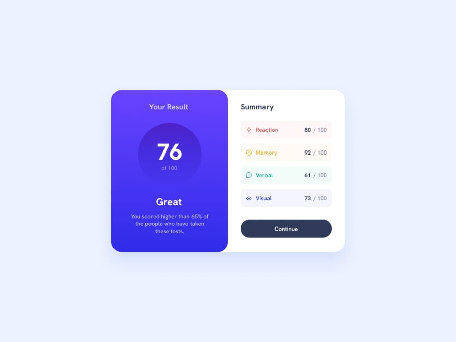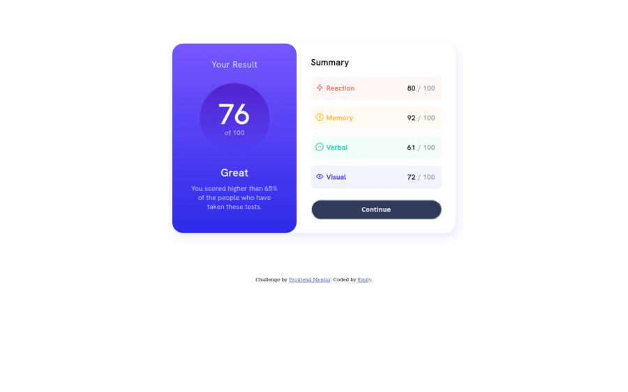
Design comparison
Solution retrospective
I decided to focus on vanilla HTML/CSS since I'm a complete beginner and wanted to practice in understanding the fundamentals before introducing things like Sass into my workflow.
When making the projects, I had a hard time understanding how to break the components into different parts, resulting in me needing to restart the project. Initially, I was trying to tackle different parts of the design all at once which ended up making things really messy. Eventually, I came up with a result by taking it by the outer layer of the design before going into the details, but I definitely feel like I could have made this more efficiently.
My main question is about best practices: how does someone start off their HTML/CSS before building on top of that foundation to create the rest of it?
Thanks!
Community feedback
- @tpercival01Posted over 1 year ago
I believe you have the idea down quite well.
Personally I like to start how the Readme suggests: build your html first. Just look at the design and decide what components you need, perhaps even researching typical HTML elements used for certain aspects, i.e. flexbox or grid for positioning elements within an element. Then when you're happy with the structure, start adding your CSS in segments; top-to-bottom, right-to-left. I prefer to work on getting the general styling down for everything before going back over with all the colours, shadows, etc.
Marked as helpful0@ilyemmPosted over 1 year ago@tpercival01
Ah! That's definitely good advice. I've already started with the Product Review challenge and am running into trouble with positioning for the mobile view after I've already built out the entire desktop view.
Thanks for taking the time to reply! I appreciate the feedback. :)
0 - @taco-nekoPosted over 1 year ago
Can you explain what exactly you mean by breaking the components down and starting from the "outer layer"? I think I get what you mean, but the wording is confusing for me and I don't want to assume only to get it wrong. If you could elaborate a little more on what your workflow was I could offer some advice on it.
Personally, I always start with getting the basic layout of the page down without worrying about styling until everything is in the right place. Your HTML is well structured, with the exception that you don't have a
<main>
tag. Just wrap your whole card in that, and it should be good.One piece of advice I'd like to give you based on your code: avoid
display: table
. It's really rare that you'll ever need to use it,flex
orgrid
is a much better (and simpler) option for this kind of layout. I think you could have simplified the CSS for the summary elements a lot.I think despite the troubles you had, you nailed the design down pretty well! Keep it up!
Marked as helpful0@ilyemmPosted over 1 year ago@taco-neko Apologies for the confusion!! When I mean "outer layer", I meant like the container that has all the components which in this case was just the entire design. For example, I structured the HTML to have the <div> for the entirety of the design before breaking into more <div>'s for the results and summary and etc. Based on your feedback, it seems like it was a good choice to do that!
In regards to the <main> tag, what does it do functionally? It seems like it would do something similar to a div. I get a lot of warnings or errors when adding the <img> for not adding an alt which I understand is for accessibility purposes. Is the <main> tag for accessibility as well?
Ah, thanks for pointing out the display: table. I'll change that up in the next challenge!
For learning how to better simplify the CSS, is there a resource I could look at to learn more? Or is this something that comes with more practice?
Thank you for taking the time to reply!! I appreciate the feedback. :)
1@taco-nekoPosted over 1 year ago@ilyemm Yeah, that's what I figured you meant by outer layer, but I just wanted to clarify. I'd say that's a good way to work.
Yes,
<main>
is a landmark like<header>
or<footer>
so it's mainly for accessibility. When it comes to styling you can treat it like a div, but in a real world example you'd probably just use it as the container for all the website's main components rather than using it as its own component. Also when it comes to images, they just need to have an alt tag, that alt tag doesn't necessarily need to contain text, especially if it's just a decorative icon.When it comes to CSS, I would highly suggest Kevin Powell's channel on Youtube because he covers the fundamentals very well and explains things in a very easy to understand way. I think he even has a video of him solving this very challenge. As for simplifying it, it comes with a bit of practice, you eventually realise where you can omit things or where you can use something else that's simpler. I've had a lot of moments where I spent 3 hours trying to figure out how to do something, only to take a break and come back and realise I could have solved it in 5 minutes- but that's just part of the learning process, lol!
Good luck on your future challenges!
Marked as helpful0@ilyemmPosted over 1 year ago@taco-neko Ah, that makes sense! I'll definitely keep in mind of
<main>
moving forward.And thanks for the recommendation! I'll definitely check him out! CSS was always the thing stopping me from really learning front-end until recently, so it's nice to know that there's a channel that covers the fundamentals.
Thanks again for your feedback!! I really appreciate it :))
1
Please log in to post a comment
Log in with GitHubJoin our Discord community
Join thousands of Frontend Mentor community members taking the challenges, sharing resources, helping each other, and chatting about all things front-end!
Join our Discord