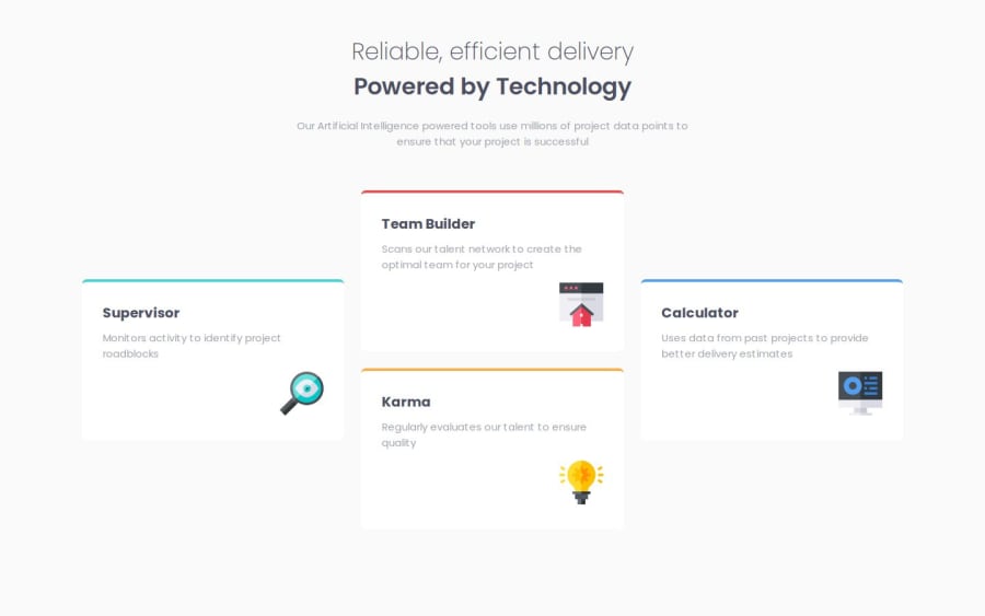
Design comparison
Solution retrospective
Took some little bit help from YouTube, because that Plus shaped Div concept is new for me.
Community feedback
- @AnwarMestycerPosted 8 months ago
-
You did well on small screens but it appears you have a problem on the desktop screen.
-
In HTML, the main tag should wrap all the page content and then wrap all four divs into one section.
- this code must be sufficient to make it work on desktop screen:
@media(min-width: 1024px){
display: flex;
flex-direction: row;
flex-wrap: wrap;
}
now it's up to you to make it exactly like the design.
Hope this was helpful
0@aayushyadavzPosted 8 months ago@AnwarMestycer Thanks for your suggestion but if I'm going to do some changes then I have to invest a lot of time into this & I have many more things to learn & If you want to correct something then you can go onto my github and find this Repo and corrects things. I'll accept your contribution.
0 -
Please log in to post a comment
Log in with GitHubJoin our Discord community
Join thousands of Frontend Mentor community members taking the challenges, sharing resources, helping each other, and chatting about all things front-end!
Join our Discord
