Design comparison
Solution retrospective
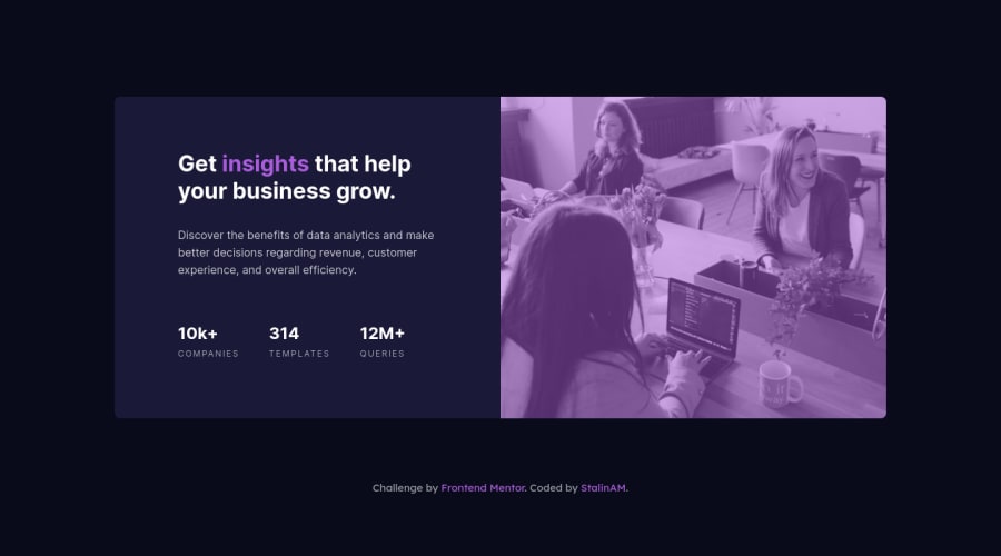
This is my solution for this challenge, I have a question: Is the div used correctly for the container and the ul tag? Any advice you can give me to improve it would be appreciated.
Community feedback
- @correlucasPosted about 2 years ago
👾Hello Stalin, congratulations for your new solution!
🎯 Your solution its almost done and I’ve some tips to help you to improve it. If you want to add the same effect of the design for the image overlaying it with
purple
there's a shortcut that is by usingmix-blend-mode
with the modemultiply
and with an opacity aroundopacity: 82%
. See the code below:img { mix-blend-mode: multiply; opacity: 82%;}
Use a CSS reset to avoid all the problems you can have with the default CSS setup, removing all margins, making the images easier to work, see the article below where you can copy and paste this css code cheatsheet: https://piccalil.li/blog/a-modern-css-reset/
✌️ I hope this helps you and happy coding!
Marked as helpful0 - @SouiciaPosted about 2 years ago
Hello Stalin,
Congratulations on completing this challenge! It looks really great and is responsive.
There are some parts that could be slightly improved. First of all, you could have declared font-family 'Inter' in the :root pseudo, that would have made your CSS DRYer. If you need to change font-family further down the line, just redeclare font-family with another one on the class. Also, I think you should have customized your information container with a display flex, that would have enabled you to use the gap property and remove the amount of margins you declare. Continuing on that, you could have used margin: 0 auto to center the div, calc function on width to give it padding on the side. That would have enable you to delete your paddings on the children. Another thing, if there is only 2 elements within a div, for instance your information-container and the picture container within your main, I would use flexbox, not grid. Then you can just change the way elements are displayed with flex-direction, I believe it makes it easier. Last point, you may want to play with min and max width, to make it a bit more responsive to screen sizes, but that's just a bonus.
All in all, your solution is concise, nicely written and works well, so once more, congratulation! Have a great day! :)
Marked as helpful0
Please log in to post a comment
Log in with GitHubJoin our Discord community
Join thousands of Frontend Mentor community members taking the challenges, sharing resources, helping each other, and chatting about all things front-end!
Join our Discord