Design comparison
Solution retrospective
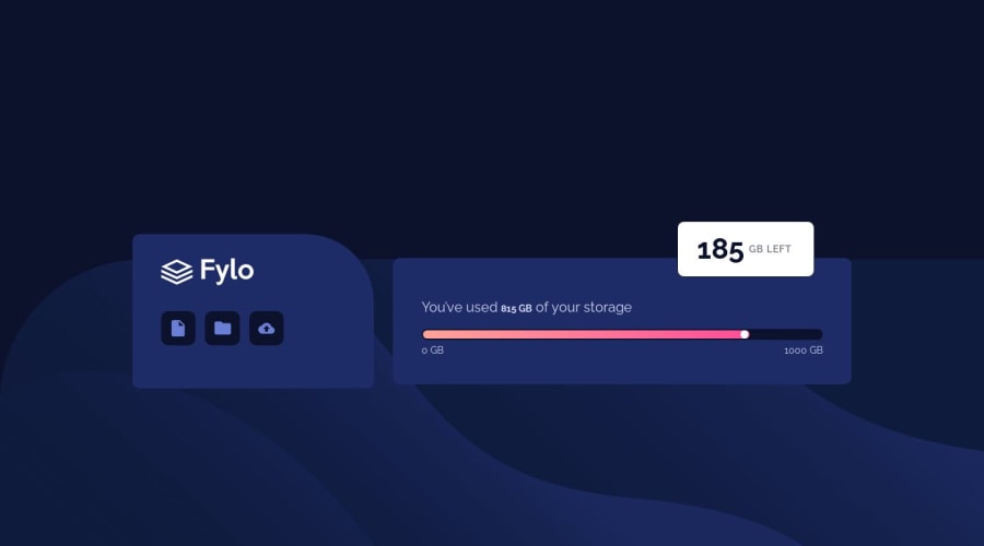
Couldn't do the little arrow on desktop screen, ask for help on slack but nobody answered. I would be glad if anybody can tell me how to do it.
Community feedback
- @jfprenticePosted about 4 years ago
I really like the transition you added to the progress bar, very nice touch!
0 - @markup-mitchellPosted about 4 years ago
Hi Pierre,
People do it different ways - there's a thing you can do with the border of a div but IMO a small inline SVG is simpler and more explicit:
<svg height="23" width="23" viewBox="0 0 24 24"> <polygon points="23,23 0,23 0,0" /> </svg>
0@bsabarduPosted about 4 years ago@markup-mitchell great ! Do you have any to to generate this SVG ?
0@Rem0ldPosted about 4 years ago@markup-mitchell Thanks for this! I was actually trying with shapes and transfrom (rotate, skew) and I forgot I could create svg shapes so easily. Very nice trick.
0
Please log in to post a comment
Log in with GitHubJoin our Discord community
Join thousands of Frontend Mentor community members taking the challenges, sharing resources, helping each other, and chatting about all things front-end!
Join our Discord