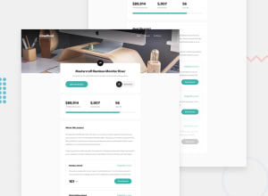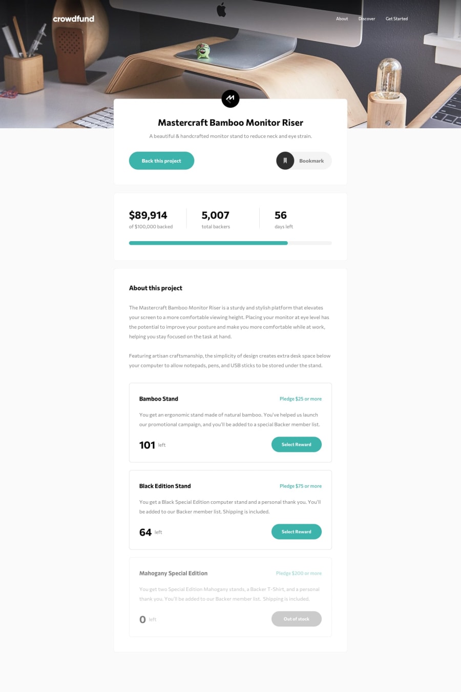
Design comparison
Community feedback
- @pikapikamartPosted over 3 years ago
Great work but yes, desktop needs layout hehehe and a suggestion also. In your modal pop-up, since it is overflowed auto, scrollbar appears right, well you could remove this but have the functionality, add this line if you want
.example::-webkit-scrollbar {
  display: none;
}

/* Hide scrollbar for IE, Edge and Firefox */
.example {
  -ms-overflow-style: none;  /* IE and Edge */
  scrollbar-width: none;  /* Firefox */
}
That is from w3schools and that way, the scrollbar will be hidden but you can still scroll^
1 - @vincitaylaranPosted over 3 years ago
Hey there 👋
Your solution looks really good on mobile!!
In regards to your device size problem for the desktop version, would you happen to be using Google Chrome as your browser? You probably know this already, but Chrome has some awesome developer tools that can help you view your app on desktop.
Anyways, good work and I look forward to your progress 😁
1
Please log in to post a comment
Log in with GitHubJoin our Discord community
Join thousands of Frontend Mentor community members taking the challenges, sharing resources, helping each other, and chatting about all things front-end!
Join our Discord
