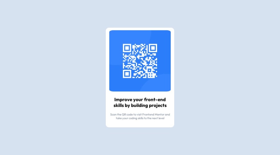
Using rem and percentage to not use media query
Design comparison
Solution retrospective
I'm not sure how this site will be shown on very small screen devices as I didnot used any media queries.
Community feedback
- @NathanRayMPosted about 1 year ago
Hello, Your design looks good on mobile devices that this design was based off of. Nice work! The size of the challenge itself is small enough that you shouldn’t need a media query in terms of screen size. You can check how your design will look by using the dev tools in your browser. Here is an article on how to do so. I hope this helps.
In Chrome: In DevTools, click Toggle Device Toolbar or press Ctrl+Shift+M (or Cmd+Shift+M on macOS). In Edge: In DevTools, click Toggle device emulation or press Ctrl+Shift+M (or Cmd+Shift+M on macOS)
0
Please log in to post a comment
Log in with GitHubJoin our Discord community
Join thousands of Frontend Mentor community members taking the challenges, sharing resources, helping each other, and chatting about all things front-end!
Join our Discord
