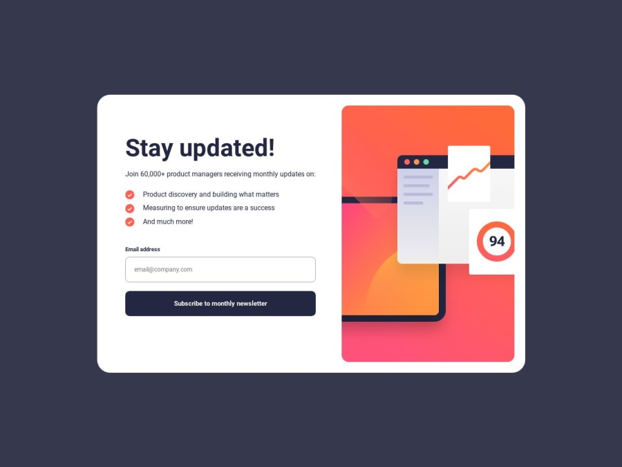


Design comparison

Solution retrospective
In App.js, I use this approach to change from illustration-sign-up-mobile.svg to illustration-sign-up-desktop.svg``` when width > 800px`. But I am not sure if this is a good solution because:
- When I change from desktop to mobile view using Chrome DevTool with dimension: iPhone SE, I have to refresh the page so that the website updates the mobile svg. Pic1 Pic2 Pic3
- when I change back from mobile to desktop, i have to refresh the page again so that the website updates the desktop svg of my image. Pic4 Pic5
function Banner() {
  return window.screen.width > 800 ? (
    <img src={BannerDesktop} alt="Banner Desktop" className="banner-desktop" />
  ) : (
    <img src={BannerMobile} alt="Banner Mobile" className="banner-mobile" />
  );
}
Community feedback
- @Moulaye-dagnonPosted 11 months ago
You can use the hooks for this :
     const [WidthScreem, setWidthSreem] = useState(window.innerWidth)
useEffect(()=>{
	const handleResize = ()=> setWidthSreem(window.innerWidth)
	window.addEventListener('resize', handleResize)
	return ()=> window.removeEventListener('resize', handleResize)
},[])
A litle explain :
const [WidthScreem, setWidthSreem] = useState(window.innerWidth) Here we used the state hook and initialized it with the screen size After , you can use an Event on the window so that every time the screen size changes we call seTsetWidthSreem() again . Here we can say that useEffect allows you to automatically refresh the page
0 - @vuson1709Posted 11 months ago
I found the solution, here is my updated code:
function Banner() {
  return (
    <picture>
      <source media="(min-width:800px )" srcSet={BannerDesktop} />
      <img src={BannerMobile} alt="Banner Mobile" className="banner-mobile" />
    </picture>
  );
}
0

Please log in to post a comment
Log in with GitHub
Join our Discord community
Join thousands of Frontend Mentor community members taking the challenges, sharing resources, helping each other, and chatting about all things front-end!
Join our Discord