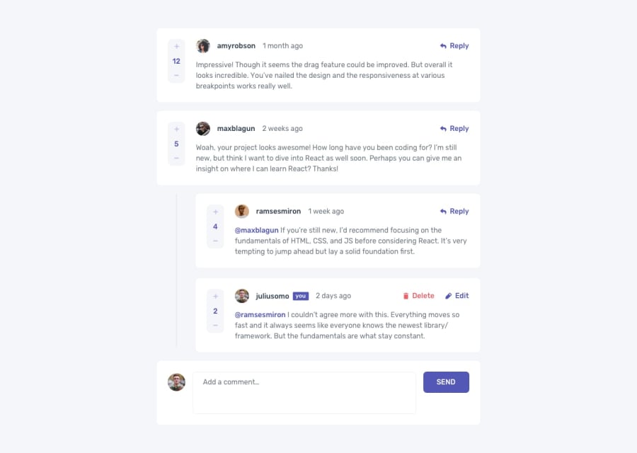
Design comparison
Solution retrospective
this was one of my hardest project I have ever done and still edit button does not work I did use React for this project and had lots of fun using react!
Community feedback
- @kofinarteyPosted over 2 years ago
Hey Arash, currently, your edit functionality doesn't seem to work, so you could look at that. I tried to look at you code on but it seems you didn't put in the right link to the repository so I can't offer any specific contribution as at now.
But on the CommentsSection div, setting a width of 90% and 60% for mobile and desktop screen sizes respectively should make them a lot more centered.
I'd also suggest maintaining the paragraph(<p>) font-size of 16px for desktop sizes.
Beyond that, you have a decent application. Keep it up.
Marked as helpful1 - @fadhilradhPosted over 2 years ago
Hi Arash,
Your project looks good ! It matches the design.
Can you provide link to your github repo so I can see why the edit button did not work ?
Marked as helpful1@deadazixPosted over 2 years ago@fadhilradh Hi that's simply because I got bored and turn out I'm putting lots of time on this project! btw feel free to checkout my github if you like my username: deadazix
1
Please log in to post a comment
Log in with GitHubJoin our Discord community
Join thousands of Frontend Mentor community members taking the challenges, sharing resources, helping each other, and chatting about all things front-end!
Join our Discord
