Design comparison
Community feedback
- @joaotfrodriguesPosted 9 months ago
Hi Shine,
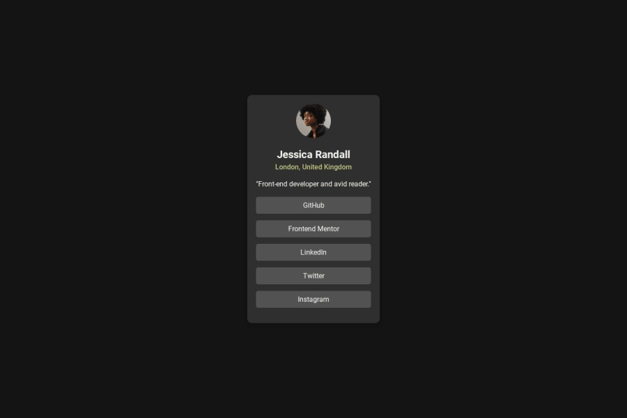
First of all, great job on your project! I loved the animation that you added to the avatar image. It adds a nice touch to the overall design.
Your use of semantic HTML is excellent. However, I would suggest putting the
<ul>inside a<nav>element since it represents a navigation menu. Also, the<main>is not supposed to be a card container. Instead, you should wrap all the card children inside a<section>element within the<main>.The colors aren't matching the design. Try using a color picker to get the correct colors from the design image to ensure consistency.
Additionally, the padding of the card needs to be bigger to make the content more readable and visually appealing.
Lastly, avoid using `
0
Please log in to post a comment
Log in with GitHubJoin our Discord community
Join thousands of Frontend Mentor community members taking the challenges, sharing resources, helping each other, and chatting about all things front-end!
Join our Discord
