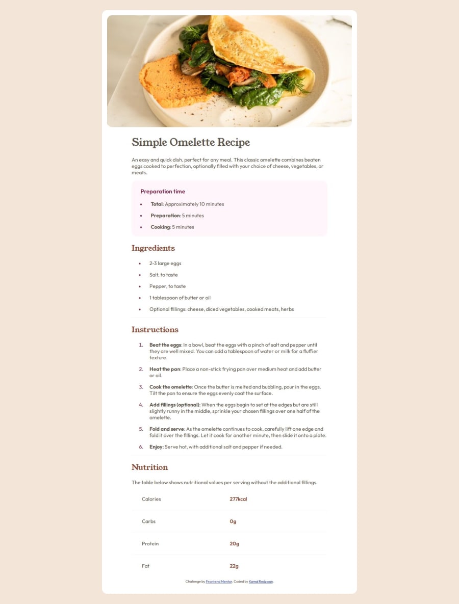


Design comparison
SolutionDesign

Solution retrospective
What are you most proud of, and what would you do differently next time?
Some things that I've learn for this project is:-
- Adding the container padding for the larger breakpoint.
- Making the text align for the 'Nutritional' section. Setting width to a percentage fixed it.
- My first mistake was not adding tags on and found a but that didn't align the paragraphs.
- Changing the background from white on small breakpoints to colored background on bigger breakpoint.
- How to use CSS variables for easy referencing of colors.
- Changing the bullet color.
Community feedback
Please log in to post a comment
Log in with GitHubJoin our Discord community
Join thousands of Frontend Mentor community members taking the challenges, sharing resources, helping each other, and chatting about all things front-end!
Join our Discord