

Design comparison
SolutionDesign

Community feedback
- @azurecodersPosted 9 months ago
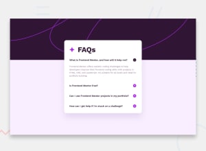
Hello brother, your overall project is very good and I also like the design. You could do one thing like there is less space from top of the line. If you will see clearly then you will find that the plus/minus icon is very close to the line so if you could add some space there then it would look much better
0

Please log in to post a comment
Log in with GitHubJoin our Discord community
Join thousands of Frontend Mentor community members taking the challenges, sharing resources, helping each other, and chatting about all things front-end!
Join our Discord