Design comparison
Solution retrospective
What challenges did you encounter, and how did you overcome them?
What specific areas of your project would you like help with?
Community feedback
- @gbtan1991Posted 10 months ago
Your code is well-structured and follows good practices, but there are always opportunities for improvement, particularly in terms of maintainability, readability, and responsiveness.
Here are a few suggestions:
-
Accessibility: Ensure your component is accessible. Use semantic HTML and ARIA attributes where necessary.
-
Responsive Design: Consider making the card responsive for different screen sizes.
-
Code Organization: Separate concerns by creating smaller components if needed.
-
Consistency in Styling: Ensure consistency in styling, using classes and utility classes appropriately.
-
Optimization: Optimize images for better performance.
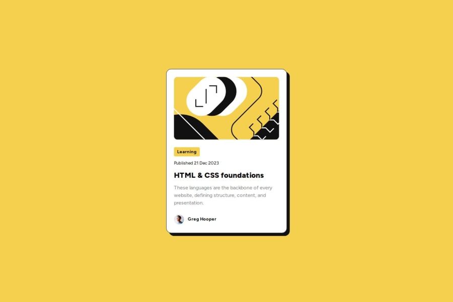
export default function Card() {
  return (
    <div className="group relative h-[522px] w-[384px] bg-white stroke-black rounded-2xl p-6 space-y-6 border border-neutral-black">
      <Image
        src="/images/illustration-article.svg"
        alt="Illustration of the article"
        width={336}
        height={200}
        className="h-[200px] w-full rounded-xl"
      />

      <div className="flex flex-col gap-3">
        <div className="font-bold text-sm bg-primary-yellow w-[82px] h-[29px] rounded-[4px] px-3 py-1 flex justify-center items-center">
          Learning
        </div>
        <p className="text-sm">Published 21 Dec 2023</p>
        <h1 className="group-hover:text-primary-yellow text-2xl font-extrabold">
          HTML & CSS Foundations
        </h1>
        <p className="text-neutral-grey">
          These languages are the backbone of every website, defining structure, content, and presentation.
        </p>
      </div>

      <div className="flex items-center gap-3">
        <Image
          src="/images/image-avatar.webp"
          alt="Profile picture of Greg Hooper"
          width={32}
          height={32}
          className="rounded-full"
        />
        <p className="text-sm font-bold">Greg Hooper</p>
      </div>

      <div className="absolute bg-neutral-black h-[522px] w-[384px] rounded-2xl -top-4 left-2 -z-10 group-hover:-top-2 group-hover:left-4 transition-all duration-300" />
    </div>
  );
}
I hope this suggestion helps you.
1 -
- @raswondersPosted 10 months ago
I like your solution, its almost pixel perfect and code is neatly organized. I've also learned about tailwind's apply directive from you. Well done. My only small concern would be regarding hard-coding height on the card. It doesn't really help here and would cause you problems with responsivity if this was a real project.
1
Please log in to post a comment
Log in with GitHubJoin our Discord community
Join thousands of Frontend Mentor community members taking the challenges, sharing resources, helping each other, and chatting about all things front-end!
Join our Discord
