Using @media query and nth-child for specific design challenges


Design comparison

Solution retrospective
-
Would plan more carefully on how to arrange or group components together, in this instance, the hero image on top should not belong as other elements, which is noticed only when supporting mobile screen.
-
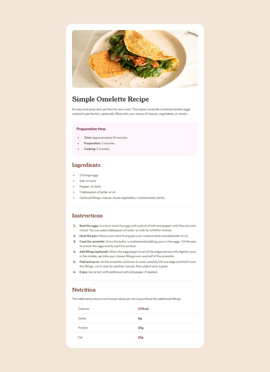
Learned more in-depth styling of table and ordered/unordered lists, including first/last/nth elements.
- Styling of unordered list marker margin was confusing for a while until realizing that we can utilize padding left of the <p> tag inside the list item.
- Dividers can be confusing for the first time, overcame with usage of nth-child attributes.
Any feedbacks are very appreciated, thank you.
Community feedback
- @jamurai77Posted 20 days ago
Looks good to me. I had much the same experience as far as the challenges mentioned in your process. Only thing I did notice though was that between the large screen size and the mobile size the content did not look that great, portions were not appearing on the screen. So the responsiveness could be improved for medium-sized screens.
Marked as helpful1P@ChanokthornPosted 20 days ago@jamurai77 Oh, I didn't notice that. I'll keep the transition between screen sizes in mind. Thank you for the advice.
0

Please log in to post a comment
Log in with GitHub
Join our Discord community
Join thousands of Frontend Mentor community members taking the challenges, sharing resources, helping each other, and chatting about all things front-end!
Join our Discord