Design comparison
SolutionDesign
Community feedback
- @VCaramesPosted almost 2 years ago
Hey there! 👋 Here are some suggestions to help improve your code:
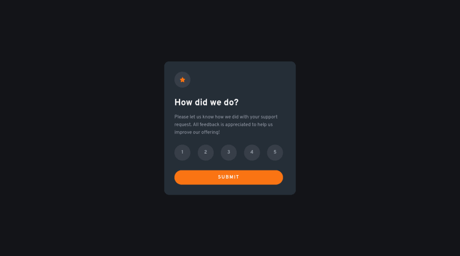
- The "star icon" is not interactive, so it should not be
button.
- The “icons/illustrations” in this component serve no other purpose than to be decorative; They add no value. There
alt tagshould be left blank and have anaria-hidden=“true”to hide them from assistive technology.
More Info:📚
https://www.w3.org/WAI/tutorials/images/
- The proper way to build the "rating buttons" in this challenge is to create a
formand inside of it, there should be fiveinput radiosand eachinputshould have alabelattached to it to make the buttons accessible. Finally wrap all theinputsandlabelsinside afieldsetto prevent users from making more than one selection.
More Info:📚
MDN <fieldset>: The Field Set element
If you have any questions or need further clarification, feel free to reach out to me.
Happy Coding!🎄🎁
Marked as helpful0 - The "star icon" is not interactive, so it should not be
Please log in to post a comment
Log in with GitHubJoin our Discord community
Join thousands of Frontend Mentor community members taking the challenges, sharing resources, helping each other, and chatting about all things front-end!
Join our Discord
