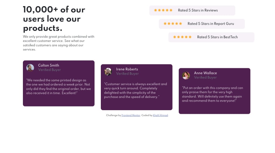
Social Proof Section Using HTML, CSS and Bootstrap 5.0
Design comparison
Solution retrospective
it is my first challenge at a front-end mentor. please review my solution and tell me that whether I need to improve it or it is good as it is.
Community feedback
- @thesohailjafriPosted over 3 years ago
Well, Great Work on your first project
You just need to adjust the color of the rating div. it too saturated compared to the og design.
Else everything is Great :]
Marked as helpful1@meer-khalilPosted over 3 years ago@thesohailjafri Thank you very much! for your feedback.
0 - @pikapikamartPosted over 3 years ago
Hey, great work on this one. The layout seems different but its fine for now, also congrats for your first challenge!!
For some suggestions:
- wrap the whole layout inside a
mainelement. This will make your layout more accessible and more structured, it also removes the issue on your report.
  <body>
    <main>
      { everything is wrapped by main}
    </main>
  </body>
But do not use the above stated layout for every challenges okay, if there are a header section that you can see on a challenge, do not wrap the
headerin amain. Have it separeted.- It would be better if you don't use heading tags on the stars. Those stars are just decorations, you don't really need to use any semantic element on them. You can declare them in the
backgroundproperty of an element. - when using headings, do not jump from
h1toh5orh6or just higher. Use them incrementally by one. Anh2orh3like those. The names of the people who are in the testimonial could haveh2 - on the
imgfor the people, on theiralttext, you can just remove theimageword, you can just leave it likealt="colton. Since screen readers will handle to describe what is the element, and in here, the element isimghence it is graphic. - on your
.cardselector, you don't really need to add awidth: 375pxsince you already declared awidth: 33.3333on its parent, the child will already occupy the parent size, since it is ablockelement. Removing thewidthalso makes it more responsive since the size will scale.
Other than those, good work on this one. Also if you have any question, just drop it here okay.
1 - wrap the whole layout inside a
Please log in to post a comment
Log in with GitHubJoin our Discord community
Join thousands of Frontend Mentor community members taking the challenges, sharing resources, helping each other, and chatting about all things front-end!
Join our Discord
