

Design comparison

Community feedback
- @bhuvi819381Posted 3 months ago
Hey bro Everything looks great
Brother your design is not center after giving flex too
You didn't give height Try giving min-height:100vh
And i think you should try give css variables too
And little bit here and there but it's fine You need to do some different too 😁
Another thing bro Try a chrome name pixel perfect by welldone
It'll help you make your project accurate And after upload always check reports. It also helps in accessibility and html report
I hope it'll be helpful
0 - @telsabate-hubPosted 3 months ago
Good job on using CSS Grid!
I think it would be better if you followed the font family provided. You may check the style-guide.md file as reference.
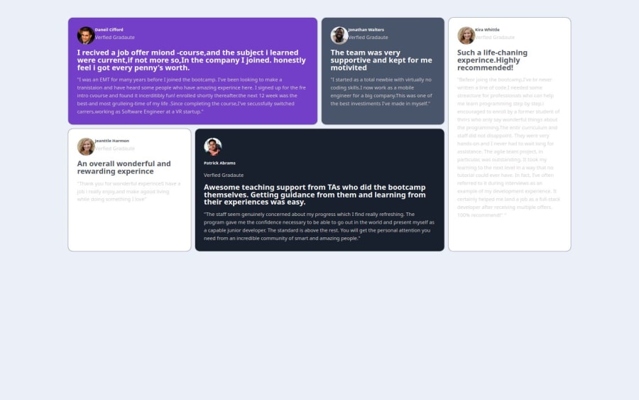
I also noticed that you have some typo errors. Just a suggestion, you could copy-paste from the provided html file so that you won't have to type the texts and be prone to errors.
Thank you and happy coding! :)
0


Please log in to post a comment
Log in with GitHubJoin our Discord community
Join thousands of Frontend Mentor community members taking the challenges, sharing resources, helping each other, and chatting about all things front-end!
Join our Discord