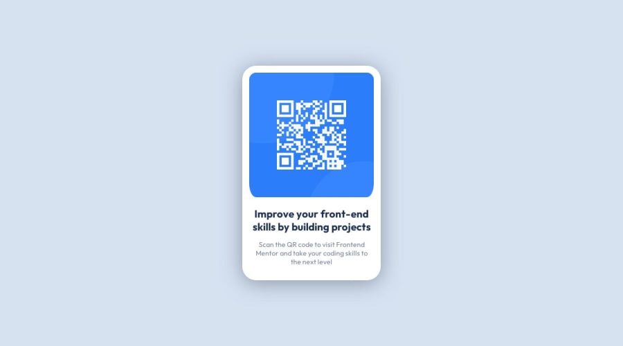
Design comparison
Solution retrospective
Improvements made
-
Since the previous project on single-price-grid-component-master, i have made some improvements to my coding which has doubled time efficiency allowing me to complete this project quickly
-
plain background as from the design image a consistent class naming system using ARIA tags and landmark main in HTML using colors in variable names first in CSS I found that a consistent width and height for this worked on all devices, quick fix! Didn't need to use flex either
Some changes:
- I implemented 100% height and width on html and body, is this common practice? please check:
- is my box-shadow too strong? how do i make it fainter but not have a large blur radius?
Community feedback
- @danielmrz-devPosted 10 months ago
Hello @Mercury225!
Your project looks great!
I noticed that you used
positionto place the card in the middle of the page. Here's a very efficient way (and better) to center the card:- Apply this to the body (in order to work properly, don't use position or margins):
body {
    min-height: 100vh;
    display: flex;
    justify-content: center;
    align-items: center;
}
I hope it helps!
Other than that, great job!
Marked as helpful0@Mercury225Posted 10 months agoThank you thank you thank you! I've changed it and added you in comments :) @danielmrz-dev
1
Please log in to post a comment
Log in with GitHubJoin our Discord community
Join thousands of Frontend Mentor community members taking the challenges, sharing resources, helping each other, and chatting about all things front-end!
Join our Discord
