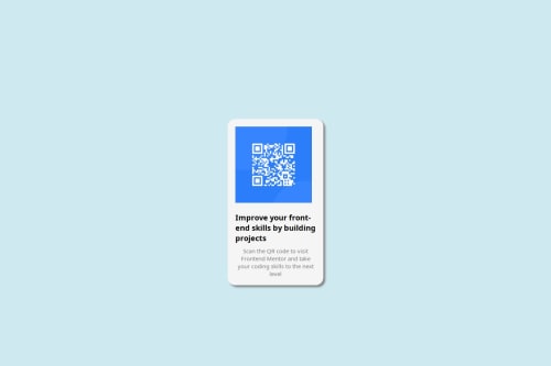
Not Found
Not Found
Not Found
Not Found
Not Found
Not Found
Not Found
Not Found
Not Found
Not Found
Not Found
Not Found
Not Found
Not Found
Not Found
Not Found
Not Found
Not Found
Not Found
Not Found

Submitted

Using Html and css to create a QR code component.

Nalish 40

@Nalish

Desktop design screenshot for the QR code component coding challenge

This is a solution for...

  • HTML
  • CSS
1newbie
View challenge

Design comparison


SolutionDesign

Solution retrospective


What are you most proud of, and what would you do differently next time?

One thing. that I am very proud of is the styling of the component. Knowing how to rightly position the div elements to get a design similar to the one that was provided.

What challenges did you encounter, and how did you overcome them?

One challenge I encountered is knowning the exact colours that were used especially in the background. I overcame it by selecting a color similar to it and manipulating its RGB values to obtain a color very close to it.

What specific areas of your project would you like help with?

Areas I would love some help in is knowing how to position the QR code to the centre of the page.

Community feedback

P
Steven Stroud 11,810

@Stroudy

Posted

Exceptional work! You’re showing great skill here. I’ve got a couple of minor suggestions that could make this stand out even more…

  • Using a <main> tag inside the <body> of your HTML is a best practice because it clearly identifies the main content of your page. This helps with accessibility and improves how search engines understand your content.

  • Having a clear and descriptive alt text for images is important because it helps people who use screen readers understand the content, making your site more accessible. It also improves SEO, as search engines use alt text to understand the image's context, helping your site rank better, Check this out Write helpful Alt Text to describe images,

<img src="./images/image-qr-code.png" width="200">
  • Using a full modern CSS reset is beneficial because it removes default browser styling, creating a consistent starting point for your design across all browsers. It helps avoid unexpected layout issues and makes your styles more predictable, ensuring a uniform appearance on different devices and platforms, check out this site for a Full modern reset

  • Here you can use a short hand to reduce code but does the same thing,

    margin-left:auto;❌
    margin-right: auto;❌
---------------------------------------------------
    margin-inline: auto;  This does left and right ✅
  • While px is useful for precise, fixed sizing, such as border-width, border-radius, inline-padding, and <img> sizes, it has limitations. Pixels don't scale well with user settings or adapt to different devices, which can negatively impact accessibility and responsiveness. For example, using px for font sizes can make text harder to read on some screens, Check this article why font-size must NEVER be in pixels. In contrast, relative units like rem and adjust based on the user’s preferences and device settings, making your design more flexible and accessible. Use px where exact sizing is needed, but prefer relative units for scalable layouts. If you want a deeper explanation watch this video by Kevin Powell CSS em and rem explained. Another great resource I found useful is this px to rem converter based on the default font-size of 16 pixel.

I hope you’re finding this guidance useful! Keep refining your skills and tackling new challenges with confidence. You’re making great progress—stay motivated and keep coding with enthusiasm! 💻

Marked as helpful

0
Huy Phan 1,860

@huyphan2210

Posted

Hi, @Nalish

I took a look at your solution and have some thoughts:

  • It seems you didn't use the provided starter files for the challenge. These usually include a style-guide.md file that outlines details like colors and font sizes. Referring to this will make styling easier and more consistent with the challenge requirements.
  • Your card is centered, but the body doesn’t cover the full viewport—what you referred to as “the page.” To fix this, set min-height: 100vh on the body to ensure it stretches across the entire viewport. Since you’ve already used display: flex on the body, you can also apply justify-content: center and align-items: center to center the card both vertically and horizontally.

Hope this helps!

Marked as helpful

0

@SvitlanaSuslenkova

Posted

src="/images/image-qr-code.png"

change to src="./images/image-qr-code.png"

body { display: flex; flex-direction: column; justify-content: center; align-items: center; min-height: 100vh; } Try this to align(top-bottom) and justify(left-right) your project to the center. It applies to the parent component(body), don't forget about !!min-height!!. You can use grid instead of flex too.

Marked as helpful

0
Nalish 40

@Nalish

Posted

The design was good however the background color did not march accurately.

0

Please log in to post a comment

Log in with GitHub
Discord logo

Join our Discord community

Join thousands of Frontend Mentor community members taking the challenges, sharing resources, helping each other, and chatting about all things front-end!

Join our Discord