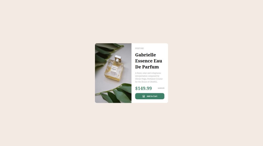


Design comparison

Community feedback
- @bhuvi819381Posted about 2 months ago
Hello,
I reviewed your solution, and it looks great! Here are a few suggestions to make it even better:
-
🏷️ Use Semantic Tags
Incorporate semantic tags like<main>,<section>,<article>, etc., to improve the structure and accessibility of your code. -
📚 Follow Heading Hierarchy
Use headings in a proper hierarchy, starting with<h1>and following with<h2>,<h3>, and so on. -
🖼️ Alt Attributes
If an image is decorative, you can leave thealtattribute blank for better accessibility. -
📏 Avoid Fixed Heights
Instead of using a fixed height, opt formin-heightor avoid setting the height altogether for better responsiveness. -
❌ Avoid Using
px
Use relative units likeremoreminstead ofpxfor better scalability. -
✍️ Line through Tags
Instead of<h6>, you can style your text with a<span>or use the<s>tag if the text is meant to be strikethrough. -
🌟 Pixel Perfect Design
If you don't have a Figma file, you can use a Chrome extension called Pixel Perfect by WellDone. -
🛠️ Check for Errors
After submitting the solution in frontend mento, always check the error report of HTML and accessibility. If you find errors, just solve them.
These changes will help improve your code quality and ensure better responsiveness. Keep up the awesome work! 👏
Best regards,
A Frontend Friend0 -

Please log in to post a comment
Log in with GitHubJoin our Discord community
Join thousands of Frontend Mentor community members taking the challenges, sharing resources, helping each other, and chatting about all things front-end!
Join our Discord