Design comparison
SolutionDesign
Community feedback
- @shashiloPosted over 4 years ago
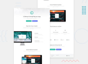
From a glance, this looked really good Kushank. But when I compared it to the design, here are the areas of improvement I noticed:
- Font sizes, font weight, line height, font color, in varies places are off. For example, the hero's heading font size is too small.
- The style guide calls for a
max-widthof1440px. You do not have this set at all. It looks like the development is contained, but that's because the content isn't long enough to fill the entire screen. If you look at where the paragraphs break, you'll see how wide each section should be. - The buttons are missing a drop shadow and bottom border. These are subtle features, but features that cannot be missed or the designer will yell at you. :)
- For this page, I would recommend you use classes instead of Id's. Reusability will be better with classes and I hardly use Id's unless I have to for anchor points.
- Try to avoid classes div's. It's an additional DOM element that is unnecessary.
Marked as helpful1
Please log in to post a comment
Log in with GitHubJoin our Discord community
Join thousands of Frontend Mentor community members taking the challenges, sharing resources, helping each other, and chatting about all things front-end!
Join our Discord
