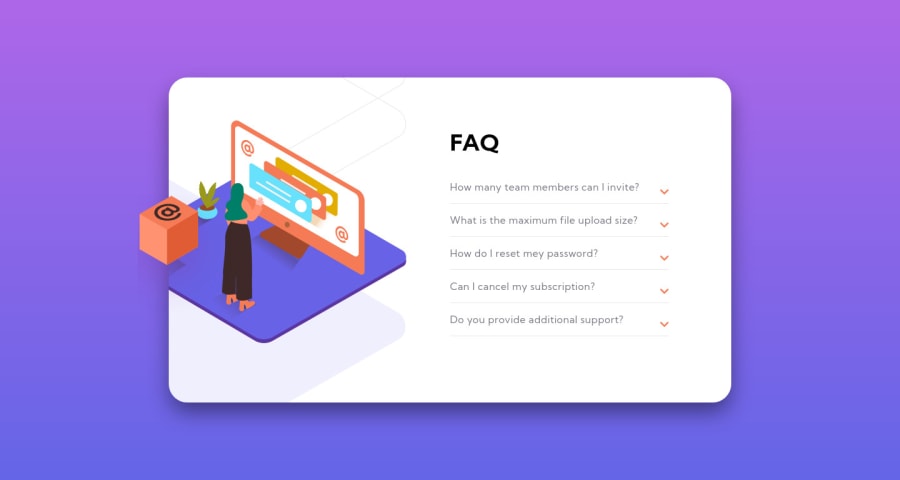
Design comparison
SolutionDesign
Solution retrospective
css was so hard. . I adjusted the location to background-size. Is this right? any feedback on how to improve is welcome :).
Community feedback
- @kens-visualsPosted about 3 years ago
Hey @SH-Lee2 👋🏻
I have some suggestion on how to fix the accessibility and HTML issues. Also, some other tips.
- To fix the accessibility issue, I suggest replacing
<h3>
with<h2>
, because headings have to decrease gradually, or if you don't want to use a heading you can use a<p>
tag then change the font size. - What comes to the HTML issues, you need to change
<aritcle>
tags with regular<div>
. Because<article>
is for, as the name suggests, articles, such as newspaper article and stuff like that. It's incorrect to put an image inside an article tag. - And here is the quick tip, add those couple of lines to
.fa-chevron-down::before
, like this
.fa-chevron-down::before { position: absolute; top: -6px; right: 0; }
this will fix the position of arrows.
I hope this was helpful 👨🏻💻 one last suggestion would be, to try to implement click on the text as well, for the drop-down. Because now they only work when I specifically click on the arrows. Other than that, the layout looks good. Cheers 👾
Marked as helpful0 - To fix the accessibility issue, I suggest replacing
Please log in to post a comment
Log in with GitHubJoin our Discord community
Join thousands of Frontend Mentor community members taking the challenges, sharing resources, helping each other, and chatting about all things front-end!
Join our Discord