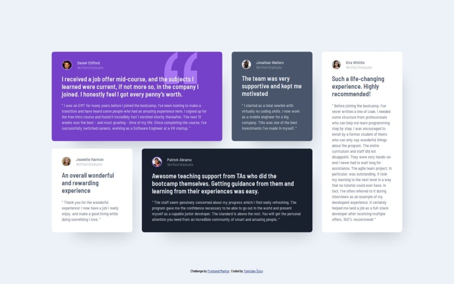
Design comparison
SolutionDesign
Solution retrospective
What are you most proud of, and what would you do differently next time?
I don't like that the dekstop layout directly transitions to a mobile layout, but I currently don't know how I should transition between the two.
What challenges did you encounter, and how did you overcome them?Besides having to get a better understanding of grid, there was nothing else in this challenge that wasn't already done in previous challenges.
Join our Discord community
Join thousands of Frontend Mentor community members taking the challenges, sharing resources, helping each other, and chatting about all things front-end!
Join our Discord
