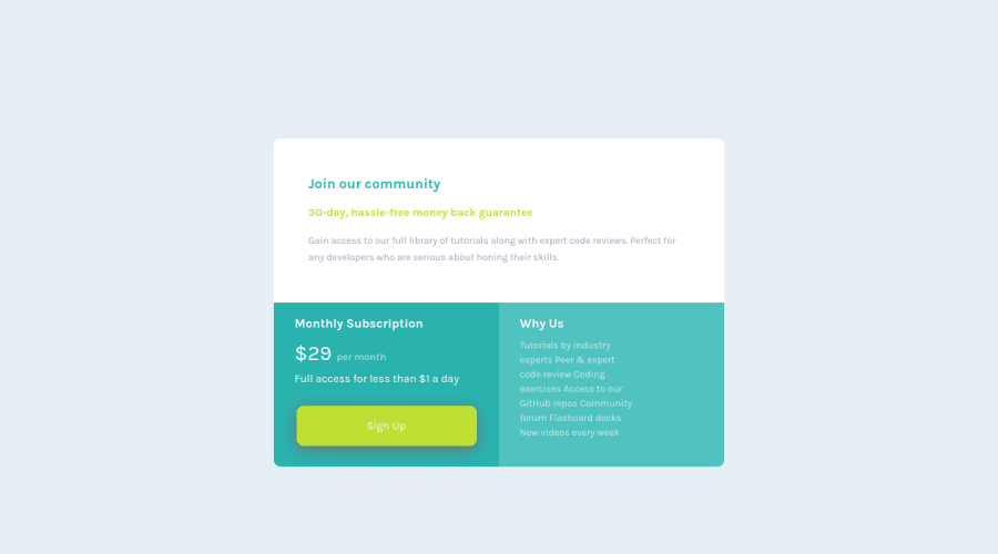
Using Grid, and trying to stick with the BEM methology
Design comparison
Solution retrospective
All comments are welcome!
Community feedback
- @larikov174Posted over 3 years ago
Hi!
- Your page has horizontal scoll from 320px and up to 1440px, should be fixed.
- Button is interactive element, so you need to add :hover to css with text opacity or some shadows change. And according to classic BEM:
- You can't use html tag names as css selector (like h1, h2, body, p is wrong)
- You should rename
callout--containerorcallout--top-headerbecause if block has element it should be separate by double underscore likecallout__container.
Marked as helpful0 - @tony1610Posted over 3 years ago
hi,
I open my index and it did not have any horizontal scroll, even with dev tools responsive devices. At least withChrome and Firefox. I will continue looking in different browser till I found the horizontal scroll.Button totally forgot about it, it will be fixed.
html tag selector, first time I heard about it, will be fixed.
For the BEM, I thought if is a block is separated by --, but if is an element inside of the block that when is separated by the __. Also, will be fixed.
Thanks
0@larikov174Posted over 3 years ago@tony1610 about scroll there is a trick with that test:
- you should open/run your page directly from index.html file, not from VS Code live server or etc.
- than devtool in your browser should be opened but mobile Toggle device toolbar should be off.
- and then start to shrink your window by pulling wider your devtool sidebar...
P.S. that will work for Windows, but for Mac you need to disable horizontal scroll hidden option (i'm not sure about how to do that exactly, just google it ).
About selectors in BEM methodology
0@tony1610Posted over 3 years ago@larikov174
Thanks for the BEM methodology link. I fixed the overflow and the container name.
Now, I have a question about the html selector. I don't want any extra margin or padding in any of my header or paragraph, even if you specify that all margin and padding are "0" in the body, all headings, paragraph and list come with their own margin and padding. If I don't use the html selectors, I will have to write the same line of code for every heading, paragraph and list. It is not better that just have one or two line of code in one place to select all of them? or there is another way? or repeating the same line of code for each individual is OK? Trying to learn the best way to code, I still have a long way. Thanks for the comments and the help.
0@larikov174Posted over 3 years ago@tony1610 according to classic BEM it is totally ok to repeat the same code for each text block, title, subtitle, heading e.t.c. There is a reason why, because if you will take this block and copy it from one place of your project to another (or even to another project) it should be looking good no matter what with no additional tuning.
I'm not saying that BEM is the bast way to organize your code and files, but this is really good way to keep it in order especially in large projects.
BEM Nested file structure is exhausting sometimes, but at the end you are getting blocks that are fits to each other just like LEGO parts do.
0
Please log in to post a comment
Log in with GitHubJoin our Discord community
Join thousands of Frontend Mentor community members taking the challenges, sharing resources, helping each other, and chatting about all things front-end!
Join our Discord
