Design comparison
Solution retrospective
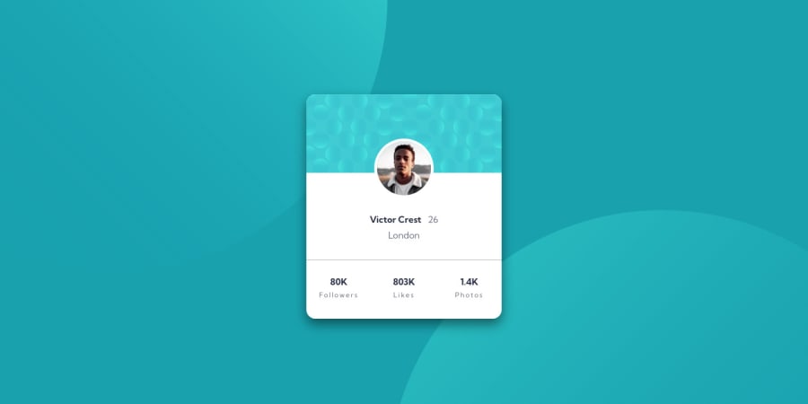
Hello everyone :D I am back at it with another challenge. Can someone please tell me why the background image on the page look goofy? I couldn't get them to align like in the preview images. Thanks in advance.
Community feedback
- @0xabdulkhaliqPosted over 1 year ago
Hello there 👋. Congratulations on successfully completing the challenge! 🎉
- I have other recommendations regarding your code that I believe will be of great interest to you.
BACKGROUND iMAGE 📸:
- let me explain how you can easily apply the
background coloralong with thebackground svgthey provided.
- Add the following style rule to your css, and then experience the changes
body { background: url(./images/bg-pattern-top.svg), url(./images/bg-pattern-bottom.svg); background-position: right 52vw bottom 35vh, left 48vw top 52vh; background-repeat: no-repeat, no-repeat; background-color: hsl(185deg, 75%, 39%); }- Tip, Don't forget to generate a new screenshot after editing the
cssfile
HEADINGS ⚠️:
- This solution has also generated accessibility error report due to lack of level-one heading
<h1>
- Every site must want at least one
h1element identifying and describing the main content of the page.
- An
h1heading provides an important navigation point for users of assistive technologies, allowing them to easily find the main content of the page.
- So we want to add a level-one heading to improve accessibility by reading aloud the heading by screen readers, you can achieve this by adding a
sr-onlyclass to hide it from visual users (it will be useful for visually impaired users)
.
I hope you find this helpful 😄 Above all, the solution you submitted is great !
Happy coding!
0 - @F4YYPosted over 1 year ago
Hello @Malekos74,
Congratulations on successfully completing the challenge. you did very well.
I have a recommendation that might interest you regarding setting the background position that will resemble like as much as the preview. Normally we can use a set of keywords like right, left, top, down, or center to place the image at the right, left, top, down, or center of the tag.
However if it is still not appropriate we can set it manually. We use in the background-position property to do this. The selector takes in two values. The first one is for the horizontal position, or x-direction (how far across the tag). The second one is for the vertical position, or y-direction (how far down the tag).
The values can be units, like a pair of pixels, eg:
background-position: 20px 30px;This will move the image 20px across and 30px down the containing tag.
or for 2 background images:
background-position: top -150px left -150px, bottom -200px right -200px;To position an image with finer detail, it is worth mentioning that we can use percentages, eg:
background-position: 20% 40%;This positions the image 20% across the tag and 40% down the tag.
Hope that would be helpful. Keep happy coding..
0
Please log in to post a comment
Log in with GitHubJoin our Discord community
Join thousands of Frontend Mentor community members taking the challenges, sharing resources, helping each other, and chatting about all things front-end!
Join our Discord
