


@Stroudy
Posted
Incredible work on this! You’re making great strides, and I have a couple of suggestions that might push it even further…
-
Using a
<main>tag inside the<body>of your HTML is a best practice because it clearly identifies the main content of your page. This helps with accessibility and improves how search engines understand your content. -
These
<div>should really have semantic tags like headings (<h1> to <h6>) and paragraphs (<p>) convey structure and meaning to content, improving accessibility, SEO, and readability by helping search engines and screen readers interpret the content.
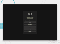
            <div class="loc">London, United Kingdom</div>
            <div class="description">"Front-end developer and avid reader"</div>
- Wrap this text in a
<a>so it is accessible with a keyboard using the tab key, Using an<a>tag for navigation is semantically correct, improves accessibility for screen readers, and ensures consistent behavior across browsers, unlike a<button>or a<div>not intended for links.
            <ul>
                <li>GitHup</li>
                <li>Frontend Mentor</li>
                <li>LinkedIn</li>
                <li>Twitter</li>
                <li>Instagram</li>
            </ul>
-
Using a full modern CSS reset is beneficial because it removes default browser styling, creating a consistent starting point for your design across all browsers. It helps avoid unexpected layout issues and makes your styles more predictable, ensuring a uniform appearance on different devices and platforms, check out this site for a Full modern reset
-
Using
remoremunits in@mediaqueries is better thanpxbecause they are relative units that adapt to user settings, like their preferred font size. This makes your design more responsive and accessible, ensuring it looks good on different devices and respects user preferences. -
I think you can benefit from using a naming convention like BEM (Block, Element, Modifier) is beneficial because it makes your CSS more organized, readable, and easier to maintain. BEM helps you clearly understand the purpose of each class, avoid naming conflicts, and create reusable components, leading to a more scalable codebase. For more details BEM,
I hope you’re finding this guidance useful! Keep refining your skills and tackling new challenges with confidence. You’re making great progress—stay motivated and keep coding with enthusiasm! 💻
Marked as helpful
