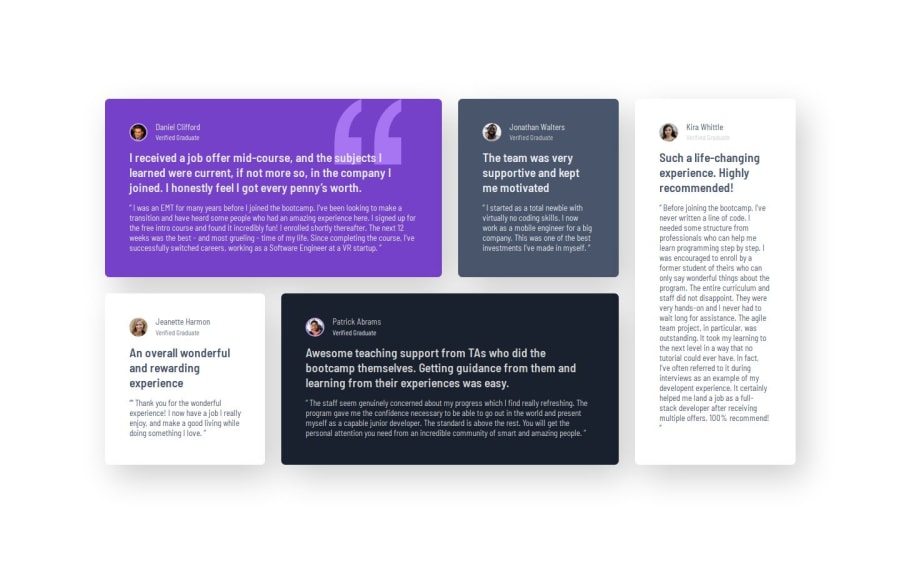
Using grid and flex for responsive UI, use quote as background image


Design comparison

Solution retrospective
- Unsure of how to handle UI when column does not flow normally, handled with hard-coded row and column selector of grid.
- I'd like to know what would be the appropriate approach on handling these layouts when the flow of cards is dynamic.
- On desktop view, what would be the way to determine the height and width of each cards? Should it be set on cards, or set on container such as grid/flex?
- Any suggestions will be very appreciated.
Community feedback
- @dar-juPosted about 1 month ago
Hi, Chanokthorn Uerpairojkit!
Great job!
- a little comment about @media. If the designer's layout has only 2 versions - desktop and mobile, this does not mean that you need to make only them. The developer's task is to also make intermediate points. The layout should look good on all devices.
For example, look at the screen resolution of 1100px, there is a narrow column with content and a lot of empty space on sides. It should not be like this.
The grid tool provides flexible block management. Your grid is initially set to 4 columns, then at 1120px it switches to 1 column. Make intermediate points - 3, 2 columns and only for the mobile version switch to 1 column.
In this case, your layout will be perfect.
-
there is a line in the code:
background-image: url("images/bg-pattern-quotation.svg"), url("testimonials-grid-section/images/bg-pattern-quotation.svg");Check, the second image does not load, you need to delete part of the code. -
if there is no caption to the image, then the <figure> tag is not necessary, you can just use <img>
Everything else is great!
I'll try to answer your questions:
- regarding the dynamism of cards, with the help of grid you can determine their position and the space they occupy in any of the screen resolutions, exactly what I wrote above
- if you use grid, then you set the size of the container, and inside you distribute the space of the blocks using grid-column and grid-row. It is better not to set the height of the blocks, it should change dynamically depending on the content.
Good luck with your development!
Marked as helpful1P@ChanokthornPosted 29 days ago@dar-ju Thanks for the insightful comment! I agree there should be multiple layouts for in-between screen sizes, I’ll improve it and will keep that in mind. And for the sizing, fixing size on containers does make sense as we prevent the size of its contents from getting smushed by changing the layout. Cheers!
0@dar-juPosted 29 days ago@Chanokthorn Yes, you are right about the container size, but only in width. I wrote specifically about the container height. Of course, there are exceptions, but usually the height is not set. This is due to the fact that the content inside can change, for example, the customer will add more text, and the layout must be stable. He is not required to understand CSS to make edits there.
1

Please log in to post a comment
Log in with GitHub
Join our Discord community
Join thousands of Frontend Mentor community members taking the challenges, sharing resources, helping each other, and chatting about all things front-end!
Join our Discord