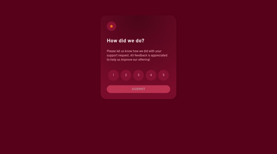
Design comparison
Solution retrospective
As a newcomer to JavaScript, I encountered some challenges while developing this project. I would highly appreciate your feedback or suggestions as they can assist me in improving my skills. Please feel free to provide any comments or recommendations you may have
Community feedback
- @visualdennissPosted over 1 year ago
Ohh look who is here doing challenges! Nice to see you here Madi :)
Love your submission btw! The custom colors u used really added a nice and unique touch. I have a small suggestion for you: Don't use margin: 80px on the body instead simply add min-height: 100vh. This will make the body cover the entire screen, (viewport height) and automatically your card will be centered. Keep it up!
Hope you find this feedback helpful!
P.s. I love cats too haha
Marked as helpful0@MadiMalikPosted over 1 year ago@visualdenniss Hi Dennis, great to see you here!
Thanks for your kind words and feedback on my submission. It means a lot to me. I'm happy to hear that you liked the custom colors I used, and I appreciate your suggestion for improving the layout. I'll definitely try it out and see how it goes.
Also, I'm glad to know that you're a cat person too! They really are the best, aren't they?
1 - @0xabdulkhaliqPosted over 1 year ago
Hello there 👋. Congratulations on successfully completing the challenge! 🎉
- I have other recommendations regarding your code that I believe will be of great interest to you.
LABELS 🔖:
inputelements wants alabelassociated with it
- A
<label>is used to create a caption for a form control. The<label>can be associated with a form control either implicitly by placing the control element inside the label element, or explicitly by using the for attribute
- Effective form
labelsare required to make forms accessible. The purpose offormelements such ascheckboxes,radiobuttons,inputfields, etc, is often apparent to sighted users
- Even if the
formelement is not programmatically labeled. Screen readers users require useful formlabelsto identifyformfields.
I hope you find this helpful 😄 Above all, the solution you submitted is great !
Happy coding!
Marked as helpful0@MadiMalikPosted over 1 year ago@0xAbdulKhalid Hi there! I appreciate your feedback on my code and I'll definitely consider adding labels to input elements to make the form more accessible for everyone, including those who use screen readers.
Thanks again for your helpful suggestion and positive feedback!
0
Please log in to post a comment
Log in with GitHubJoin our Discord community
Join thousands of Frontend Mentor community members taking the challenges, sharing resources, helping each other, and chatting about all things front-end!
Join our Discord
