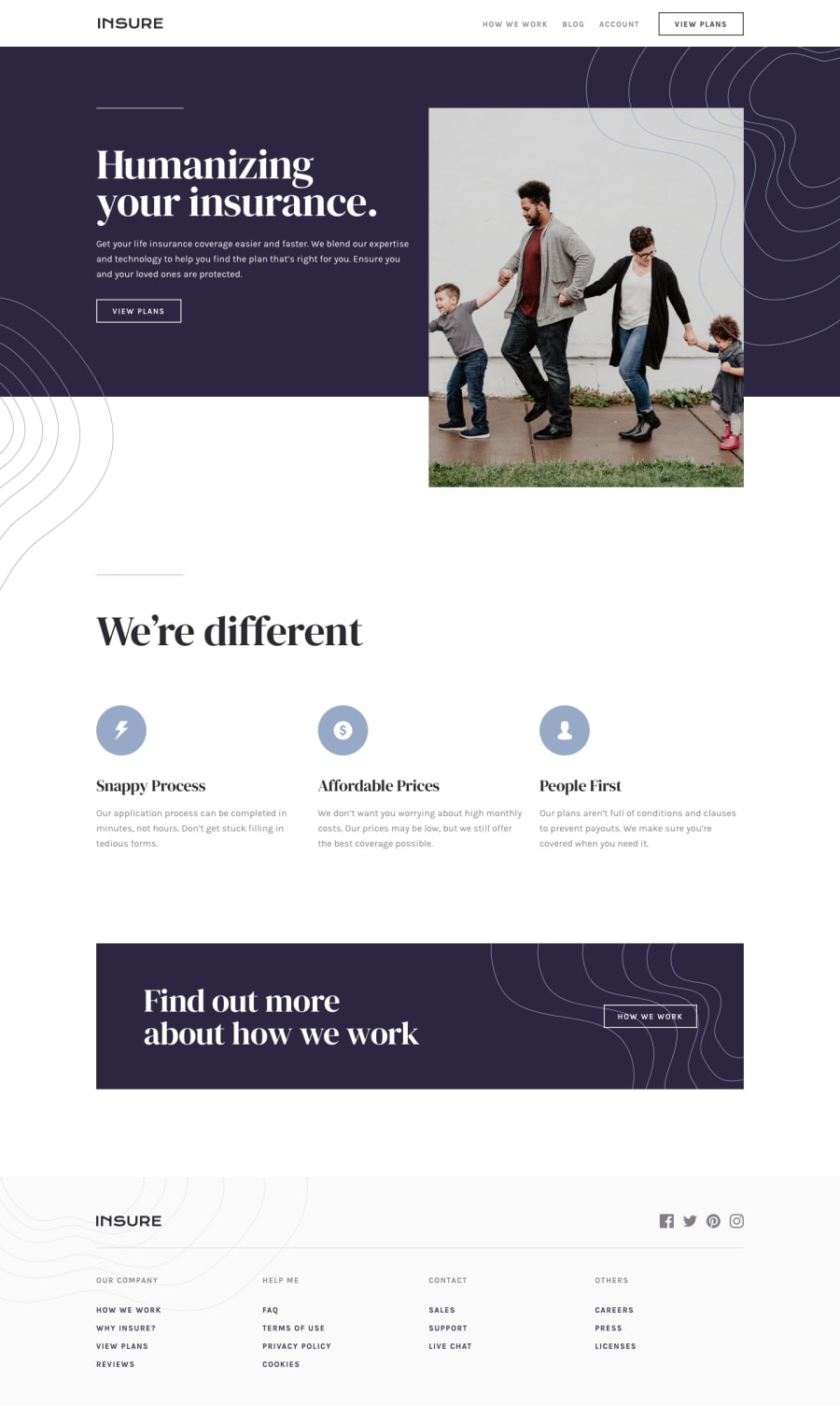
Design comparison
Solution retrospective
Pretty happy with this. Toughest parts were the various background images
Community feedback
- Account deleted
Hi,
Desktop view looks ok, nothing too out of place there.
Mobile view is ok, as long you are not seeing the mobile menu stashed on the side waiting to be activated.
I don't think it's a good idea to put the mobile where you put it while it's still inactive because I can literally see all of it. I think it would have been better to make it toggle between
opacity : 0andopacity : 1or if you really wanted that sliding effect you would have to put the mobile menu in a container gave itoverflow : hiddenso when it's not active it wouldn't be visible.1@jamiem89Posted over 3 years ago@thulanigamtee Which browser are you using? The site is wrapped in a container with
overflow-x: hiddenon. I've testing it chrome, firefox and safari and it's working as intended to me...0
Please log in to post a comment
Log in with GitHubJoin our Discord community
Join thousands of Frontend Mentor community members taking the challenges, sharing resources, helping each other, and chatting about all things front-end!
Join our Discord
