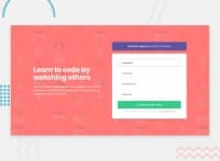
Design comparison
SolutionDesign
Solution retrospective
Rate my design please Any feedback and suggestions on how I can improve are very welcome!
Community feedback
- @janjelinekPosted over 4 years ago
Hi, first of all, nice attempt, from user point of view everything (almost) looks OK and usable, page is responsive and nothing in layout is broken. Few thinks I noticed:
- email validation is not correct, valid address like
[email protected]is not passing - For styling inputs in case of error I would recommend use toggling extra class for element. You can set default visibility for error elements as
display: noneand with some class like.activeyou can define CSS rule todisplay: blockor whatever you need. - CSS looks OK for beginner, I recommend you to check at least BEM because one of the hardest part of FE is CSS and keep it organised in larger project.
- there is more space for improvement (use at least TS, SASS or other CSS preprocessor, minify CSS/JS, images optimisation...)
Overall good work, usable for one time job (page is created and code almost never edited/updated), keep up improving your skills, you are on the good way.
1 - email validation is not correct, valid address like
Please log in to post a comment
Log in with GitHubJoin our Discord community
Join thousands of Frontend Mentor community members taking the challenges, sharing resources, helping each other, and chatting about all things front-end!
Join our Discord

