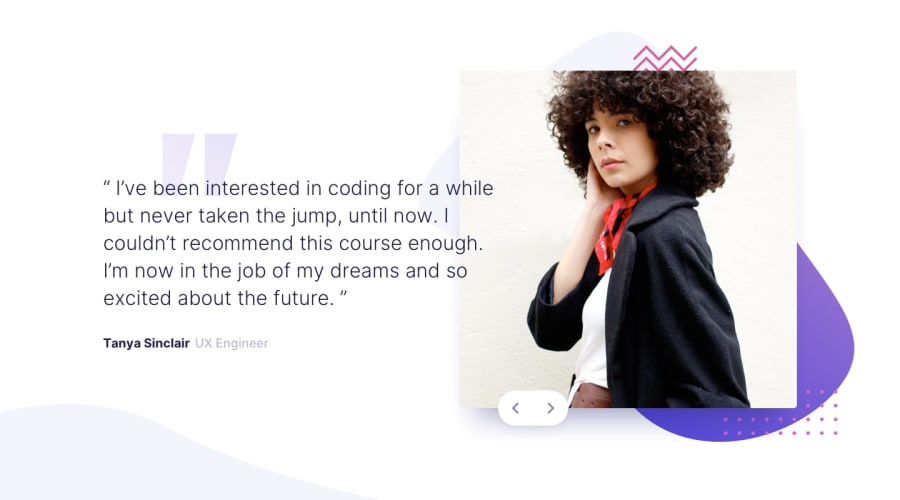
Design comparison
Solution retrospective
Rate my design please, Any feedback and suggestions on how I can improve are very welcome!
Community feedback
- @shashiloPosted over 4 years ago
Hey Esraa. Good effort here. I know you're still learning and here are some improvements I noticed:
- Do not use position: absolute in this case. It's going to make it very difficult to make the site responsive. I usually only use position: absolute to move design elements.
- The site needs to be centered
- Image is missing rounded corners
- Arrow buttons are incorrect color
- Missing background image
0 - @RusssianMusketeerPosted over 4 years ago
Hello, I had the same issue with the next and previous button. You need to set the queryselectorAll for the buttons and then use a for loop for the eventlistener for the click button function. Now your next and previous only work once, because query selector takes only the first element it sees fit, it does not take all of them. Go see my solution for the very same problem and for the same challenge, you will understand what i mean, best of luck
0@EsraaGamal-22Posted over 4 years ago@RusssianMusketeer i solved problem by another solution, can you see my code after edit ?
0
Please log in to post a comment
Log in with GitHubJoin our Discord community
Join thousands of Frontend Mentor community members taking the challenges, sharing resources, helping each other, and chatting about all things front-end!
Join our Discord

