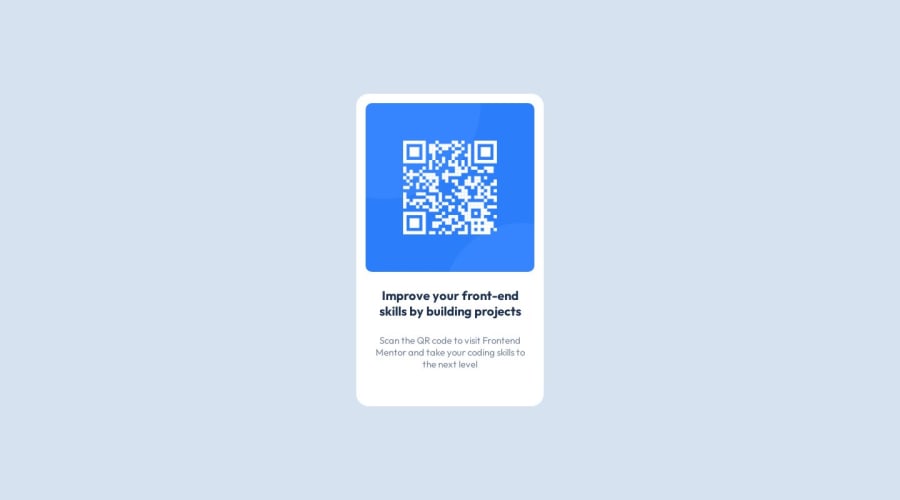
Design comparison
Solution retrospective
i'm unsure about responsive in small devices
Community feedback
- @zalewskaewa7Posted 12 months ago
Hi! , congrats on completing this challenge 🎉🎉🥳🥳
Here some tips to improve your solution. 💯🚀
HTML:
Your main content should be conteined in the main tag. More info HERE
Header elements implements six levels h1-h6, with h1 being the most important and h6 being the least important. avoid omitting header levels, your page should start with the header h1 and successively with h2...h6. More info HERE
To make your page responsive, do the following:
.container { /* width: 100vw;
height: 100vh; <- delete this*/
width: 90%; /* <- add this rule */
display: flex;
justify-content: center;
align-items: center;
max-width: 300px; /* <- add this rule */ }
Your solution is very good, keep it up!
Happy coding 🙃
Marked as helpful0
Please log in to post a comment
Log in with GitHubJoin our Discord community
Join thousands of Frontend Mentor community members taking the challenges, sharing resources, helping each other, and chatting about all things front-end!
Join our Discord
