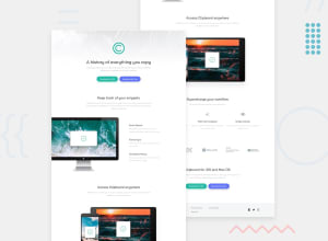
Design comparison
Solution retrospective
rate my design please, Any feedback and suggestions on how I can improve are very welcome!
Community feedback
- @ApplePieGiraffePosted about 4 years ago
Looks good, esraagamal!
Just one small thing—some of the company logos near the bottom of the page look a little vertically stretched. Since you used flexbox to layout those logos, I'd suggest setting the
align-itemsproperty tocenterrather thanstretch, and think that might fix the issue.Otherwise, good job! 🎉
Keep coding (and happy coding, too)!
1@EsraaGamal-22Posted about 4 years ago@ApplePieGiraffe can you review my code after the update?
0 - @mattstuddertPosted about 4 years ago
Awesome work on this challenge, your solution looks great! @ApplePieGiraffe has made a great suggestion with the company logos. I'd also recommend removing the changing
widthwhen the buttons are hovered. It's not a common practice. Instead, I'd just keep the nicebackground-colorand other styling changes that you've got.Your solution scales down well to mobile. Have you ever tried using
min-widthmedia queries instead ofmax-width? It's quite a common workflow with front-end developers to use them and work mobile-first. It can often lead to less CSS code and has the benefit of loading in fewer styles for mobile users, which can be a nice performance gain.I hope that helps. Keep up the great work! 👍
0@EsraaGamal-22Posted about 4 years ago@mattstuddert thanks a lot for your opinion, I will try using min-width media queries first in my next project.
0
Please log in to post a comment
Log in with GitHubJoin our Discord community
Join thousands of Frontend Mentor community members taking the challenges, sharing resources, helping each other, and chatting about all things front-end!
Join our Discord
