


Design comparison


Solution retrospective
What are you most proud of, and what would you do differently next time?
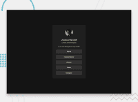
It seems to me that the organization of the HTML is correct, I should focus more on the CSS, it is not 100% as shown in the sample.
What challenges did you encounter, and how did you overcome them?
I had never learned how to use fonts and colors this way, but with a little research I was able to figure it out, I think correctly, I hope.
What specific areas of your project would you like help with?
I was unable to position the elements correctly and their size was not as shown in the sample, it was only an approximation.
Community feedback
Please log in to post a comment
Log in with GitHub
Join our Discord community
Join thousands of Frontend Mentor community members taking the challenges, sharing resources, helping each other, and chatting about all things front-end!
Join our Discord