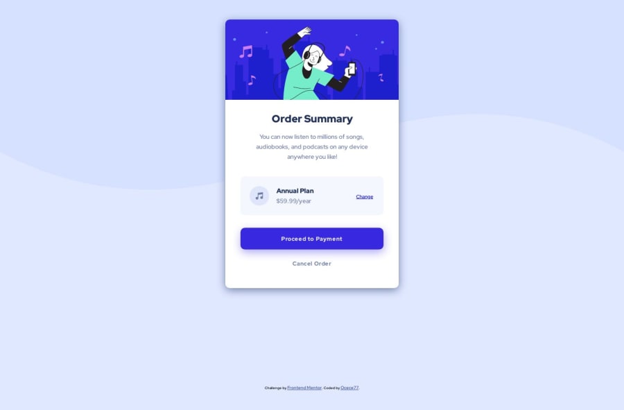


Design comparison

Solution retrospective
What did you find difficult while building the project?
-- That's stupid but the difficult thing was to setup the background. Because the starter pack has 2 background image, I thought I had to make the two images fit together like a puzzle, when in fact I had to choose one, place it at the top of the page, then apply a blue background color 🤦🏿♀️
Which areas of your code are you unsure of?
-- My media queries because when I shrink my page, my container becomes weird haha, but when I look at it with the firefox development tool on different devices, my media queries work correctly 🤨I need to practices my media queries😪
Do you have any questions about best practices?
Yes , especially about media query ! 🧐
Community feedback
Please log in to post a comment
Log in with GitHub
Join our Discord community
Join thousands of Frontend Mentor community members taking the challenges, sharing resources, helping each other, and chatting about all things front-end!
Join our Discord