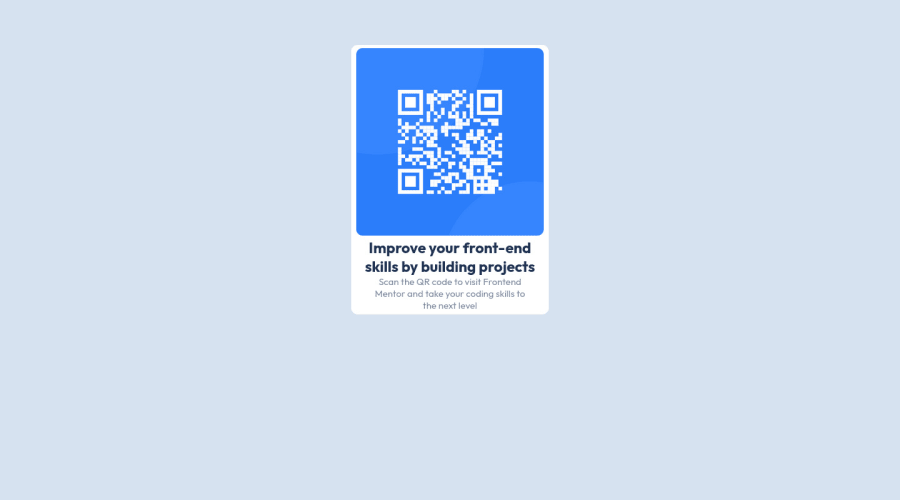
Design comparison
Solution retrospective
I've been doing this work just to remind me of some studies i'm working on. It was nice to do this job, although I had problem to align the DIV, and that's why it's good to remember the basics.
It wasn't hard to put all together, i had problems to align the main DIV, because I'm still learning about positions using CSS.
This project was totally about CSS.
Community feedback
- @shashikantdev3Posted over 1 year ago
Hello there 👋. Good job on completing the challenge! Here are some suggestions regarding your code that may be of interest to you.
To align the main div in the centre, there are multiple ways that you can try.
One safest way is as below:
main {
    /* margin: 5%; */
    position: absolute;
    top: 50%;
    left: 50%;
    transform: translate(-50%, -50%);
Another one is using a display Grid or Flex.
Also, you can remove margin: 5%; from main
I hope you find my comment useful 😄 Nevertheless, the solution you submitted is great! 🎉Happy coding
Marked as helpful0
Please log in to post a comment
Log in with GitHubJoin our Discord community
Join thousands of Frontend Mentor community members taking the challenges, sharing resources, helping each other, and chatting about all things front-end!
Join our Discord
