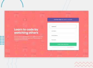
Using CSS Grid, Sass, BEM, JavaScript for form validation
Design comparison
Community feedback
- @mattstuddertPosted over 4 years ago
Awesome work on this challenge, Gabriele. Your solution looks great and scales down well to mobile. Nice work!
Have you ever tried using
min-widthmedia queries instead ofmax-width? It's quite a common workflow with front-end developers to use them and work mobile-first. It can often lead to less CSS code and has the benefit of loading in fewer styles for mobile users, which can be a nice performance gain.Also, I'd recommend adding
aria-live="polite"to error messages in your forms. This ensures screen readers announce the error text when the elements are shown on error.Keep up the great work! 👍
1@gabriardiPosted over 4 years agoHi! Thank you for the feedback. I am used to think desktop-first but I was planning on trying the mobile-first approach on the next couple of challenges. I'll see how that feels!
I added the aria-live attribute to the error messages. I admit I am new to accessibility and I should dig more into it..
0@mattstuddertPosted over 4 years ago@gabriardi you’re welcome! Yeah, I’d definitely recommend learning more about accessibility. It’s so important. Smashing Magazine is a brilliant resource for accessibility-related content if you’re interested.
0
Please log in to post a comment
Log in with GitHubJoin our Discord community
Join thousands of Frontend Mentor community members taking the challenges, sharing resources, helping each other, and chatting about all things front-end!
Join our Discord
