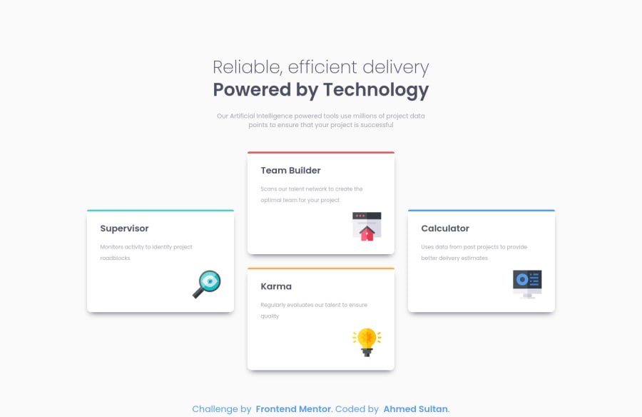
Design comparison
SolutionDesign
Community feedback
- @correlucasPosted about 2 years ago
Hello Ahmed, congratulations for you new solution!
I saw the live site and everything seems fine, your code is great too, the only thing I suggest you to change is the shadow that is too much dark and strong, to create a smooth shadow you need to give it less
opacityand moreblurhere’s a good value for this shadowbox-shadow: 5px 5px 15px 5px rgb(0 0 0 / 5%);You can use this tool to create better shadows:
https://html-css-js.com/css/generator/box-shadow/Hope it helps, happy coding!
Marked as helpful0
Please log in to post a comment
Log in with GitHubJoin our Discord community
Join thousands of Frontend Mentor community members taking the challenges, sharing resources, helping each other, and chatting about all things front-end!
Join our Discord
