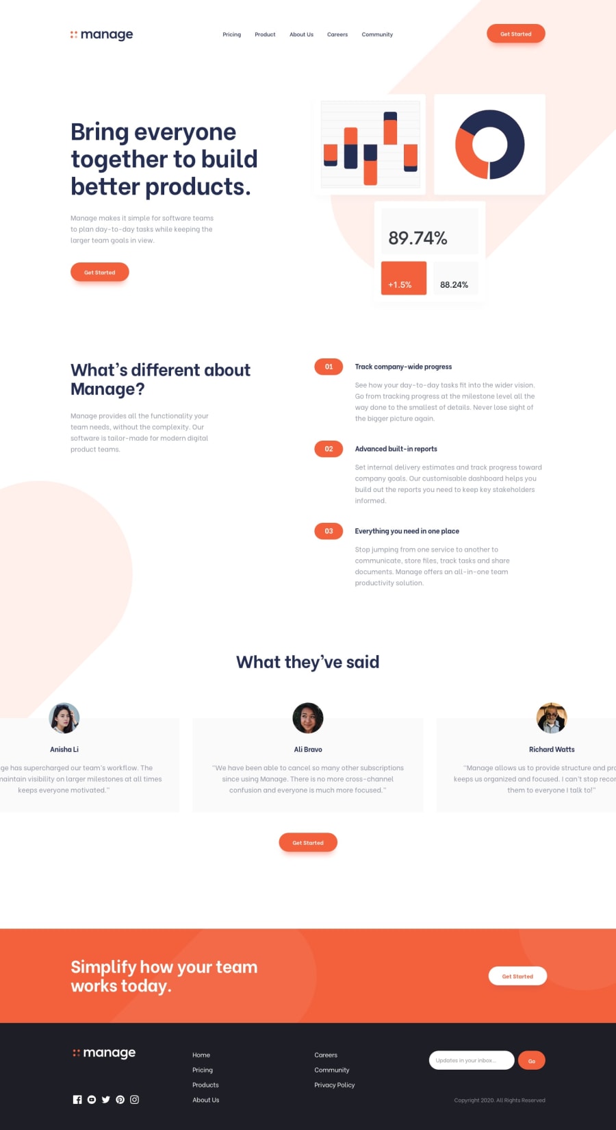
Design comparison
SolutionDesign
Solution retrospective
Nice mobile menu solution with CSS only. Hovering on bottom svg logo colorizes only its typography, which posed quite a challenge.
Please note: the screenshot doesn't show the design properly, the content is way too small. I'm not sure why this happens and I'm already in touch with the FEM staff about that.
Any feedback welcome.
Community feedback
Please log in to post a comment
Log in with GitHubJoin our Discord community
Join thousands of Frontend Mentor community members taking the challenges, sharing resources, helping each other, and chatting about all things front-end!
Join our Discord
