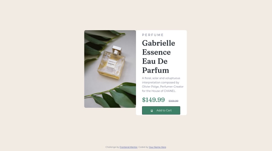
Design comparison
Solution retrospective
I cannot find the solution for the text to become responsive yet. What else should I learn to do that? I try to use "vw" unit for text but it turn out different than what I think it should act. Do you think my class="description" in css is a good practice? I feel something off but I dont know where?
Community feedback
- @maym42Posted about 2 years ago
When I want to make the text responsive, I define the text in the body with "px" units ,according to the size written in the style guide file. And in all other places(class ,elements...) I define the text size in "em" units (Relative to the font-size of the element, so 1em = current font you define in px in the body).
for example:
- for regular text define 1em
- for big text like title define 1.5 em
- for small text define 0.75 em
When you use @media for mobile screen just change the font size of the body to smaller size in "px"
and as a result all other elements with "em" units will effects form that automatically.hope I helped you 😄
Marked as helpful0 - @correlucasPosted about 2 years ago
👾Hello @Lucas760, Congratulations on completing this challenge!
Your solution its almost done and I’ve some tips to help you to improve it:
1.The image is not responsive yet, a quick way to make any image responsive and respecting the container size is to add
display: block
andmax-width: 100%
to the<img>
selector. To improve the responsiveness even more adding the auto-crop property you can addobject-fit: cover
to make the image crop inside the container its inside.img { display: block; object-fit: cover; max-width: 100%; }
2.To maintain the card responsive use
max-width
instead ofwidth
this way you allow the content to be flexible. The difference betweenmax-width
andwidth
is thatwidth
is fixed andmax-width
has a maximum size but can shrink to fit the content.2.Use the THE PICTURE TAG that is a shortcut to deal with the multiple images in this challenge. So you can use the
<picture>
tag instead of importing this as an<img>
or using a div withbackground-image
. Use it to place the images and make the change between mobile and desktop, instead of using adiv
orimg
and set the change in the css withdisplay: none
with the tag picture is more practical and easy. Note that for SEO / search engine reasons isn’t a better practice import this product image with CSS since this will make it harder to the image. Manage both images inside the<picture>
tag and use the html to code to set when the images should change setting the devicemax-width
depending of the device desktop + mobile.Check the link for the official documentation for
<picture>
in W3 SCHOOLS:https://www.w3schools.com/tags/tag_picture.asp
See the example below:
<picture> <source media="(max-width:650px)" srcset="./images/image-product-mobile.jpg"> <img src="./images/image-product-desktop.jpg" alt="Gabrielle Parfum" style="width:auto;"> </picture>
👨💻Here's my solution for this challenge if you wants to see how I build it: https://www.frontendmentor.io/solutions/product-preview-card-vanilla-css-and-custom-hover-state-on-hero-85A1JsueD1
✌️ I hope this helps you and happy coding!
Marked as helpful0@Lucas760Posted about 2 years ago@correlucas Thank you very much, you help me so much. I'll try become better to be helpful to others ^^
0
Please log in to post a comment
Log in with GitHubJoin our Discord community
Join thousands of Frontend Mentor community members taking the challenges, sharing resources, helping each other, and chatting about all things front-end!
Join our Discord