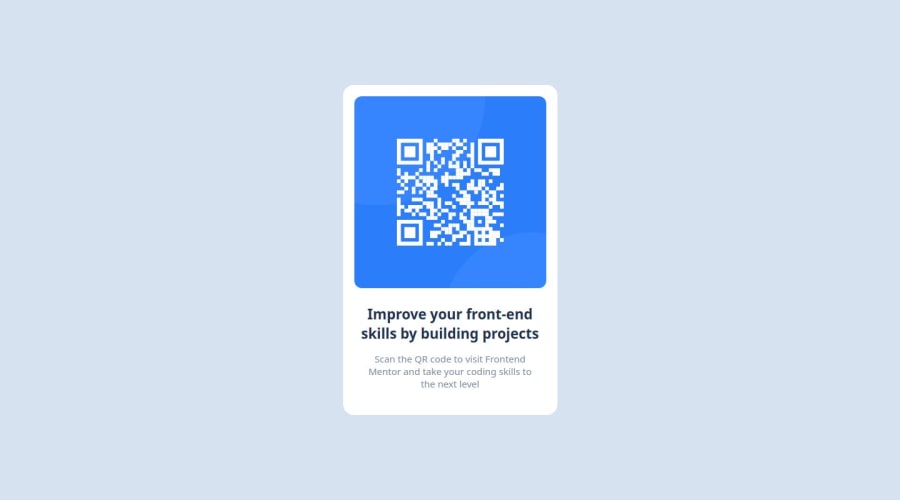
Design comparison
Community feedback
- @henryapmPosted 9 months ago
Hello @Divino-Alonso I'm going to attempt to give you some feedback.
My solution isn't perfect either but I'm supposed to give you some feedback. It seems that your design doesn't match the solution, this could be because the height and width are not stablished to be the ones the Figma file suggest to use.
I'm my case the way I solved at least that part was to hardcode those two values, if you have another way to fix it I'll be glad to hear from you.
Another suggestion I can make is that you should try to implement the use of semantic HTML elements like main, section, article, in this case particularly I personally used section to encapsulate the component and gave a
#componentid.That will be pretty much my feedback I hope you can implement some of this in your next or this present challenge.
1@Divino-AlonsoPosted 9 months agoOlá @henryapm, com seu feedback irei aperfeiçoar meu código, e me dar mais motivação para os estudos, muito obrigado.
0
Please log in to post a comment
Log in with GitHubJoin our Discord community
Join thousands of Frontend Mentor community members taking the challenges, sharing resources, helping each other, and chatting about all things front-end!
Join our Discord
