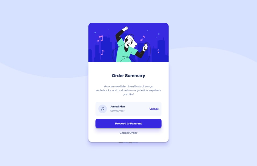
Used VSCode and used a couple videos emphasizing componentization
Design comparison
Solution retrospective
This is the first time I've really tried to do my own thing at all in code. I got considerable help from a couple people in the Slack channel because I am trying to learn how people think through their design and keep parts usable for other implementations. It probably shows in my code because I'm doing a few things that aren't optimized (importing) that I know I could avoid.
Things that don't work right and I dont know how to fix or need help with:
- Mobile version overlaps on left and messes up background when below 450px.
- In general I don't know how to keep the entire thing relative using vh/rem (or if that's even SoP)
- Resizing through 784px isn't smooth (I had it set to 700px, not sure how the final version has 784px, but i'm submitting it anyways because I was just guessing that 700 was just under likely 1024x768 and far enough over mobile that it would be rare to see resize happen organically).
What I know I did wrong and don't care for now (i'll tackle it in the future):
- Variable usage/labeling
- Any usage of Grid (I simply haven't learned it but will in the next week)
- Left various code bits in that aren't needed.
In short, I stopped my progress on learning Vue because I realized I had rather poor understanding of the DOM/html in general. I've done a lot more with back end and had to similarly stop along that progress to better understand core concepts.
Really, ANY feedback is welcome, but my preference is to tackle glaring errors or things that are "bad habits" up front.
Community feedback
Please log in to post a comment
Log in with GitHubJoin our Discord community
Join thousands of Frontend Mentor community members taking the challenges, sharing resources, helping each other, and chatting about all things front-end!
Join our Discord
