Submitted over 3 years ago
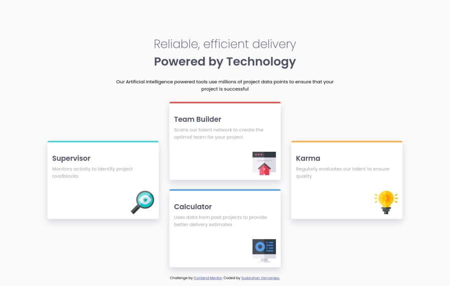
used transform to move objects in desktop design
@sudarshan2718
Design comparison
SolutionDesign
Solution retrospective
I did this with transforms, but in mobile design it don't work well. Is flex-box is a good idea?
Community feedback
Please log in to post a comment
Log in with GitHubJoin our Discord community
Join thousands of Frontend Mentor community members taking the challenges, sharing resources, helping each other, and chatting about all things front-end!
Join our Discord
