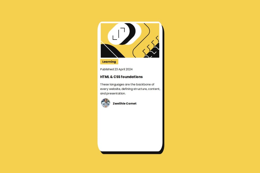
used the display of grid to place the items/content at the center


Design comparison

Solution retrospective
i am mostly proud that my media queries are a little bit getting better
What challenges did you encounter, and how did you overcome them?media queries..i always face challenges with media queries
What specific areas of your project would you like help with?mostly media queries.
Please log in to post a comment
Log in with GitHubCommunity feedback
- @erensarac
Congratulations! @Zwelihlecomet2
I reviewed your solution. I wanna help you with some feedback. In your solution, It looks like you used
percentageunits for width and height propertys. It's not something expected for responsive design usually. You should userelative lengthslike aremorem.For example. If you know your card length after the
768px (mobile). You can handle the challenge using the examples below.Example 1: You can use
calcfunction for relative width. It will be 100% width but 2rem minus. If your root have16pxso it will bewidth: 375px - 32pxand its mean your width will be343pxon 375px screen sizes. Your container already havegridandplace-items: center. So It will be centered./* It's for mobile */ .container-content { width: calc(100% - 2rem); /* 2rem for giving space left and right. */ } /* It's for desktop */ @media screen and (min-width: 768px) { .container-content { width: 24rem; } }Example 2: But if you don't wanna full width on mobile (768px and below). You can use specific width, because we know the width on mobile. It should be near the 20rem. You should use
margin-rightandmargin-leftat this method to give space around the edges./* It's for mobile */ .container-content { width: 20rem; } /* It's for desktop */ @media screen and (min-width: 768px) { .container-content { width: 24rem; } }Also you can use Flexbox at your
container-contentandtextsclasses to control your layout simply.I recommend these resources for you.
You can browse my solution here;
If you have specific questions, don't worry asking. Happy coding!
- Account deleted
Good start on the challenge, Zwelihlecomet2.
I have some things to address that could help you with your coding:
- In your HTML, you can add classes directly to the
imgorsvgtag without having to wrap them in adiv. - In your CSS, consider adding padding to your text to add space around them.
- When setting the width of an element, use pixels to keep the width still rather than stretching it.
- Be careful when adding a fixed height to your card, as it can overflow the content inside.
- You can center your content by using either the
bodyselector or using thepositionproperty inside your card. Both methods work equally well.
body {
height: 100vh; /* or 100% */
display: flex;
justify-content: center;
align-items: center;
}

/* _ _ _ OR _ _ _ */

.container-content {
position: absolute; /* or relative */
top: 50%;
bottom: 50%;
transform: translate(-50%, -50%);
/* your styles */
}
As for your media queries, they appear well. With that, I wish you luck on your next challenge.
- In your HTML, you can add classes directly to the
- @curiousdilip
Congrats on your 3rd Challenge!
However there are some improve needed in your code as i can see from the screenshot, you can reduce padding bottom
Regards Dilip


Join our Discord community
Join thousands of Frontend Mentor community members taking the challenges, sharing resources, helping each other, and chatting about all things front-end!
Join our Discord